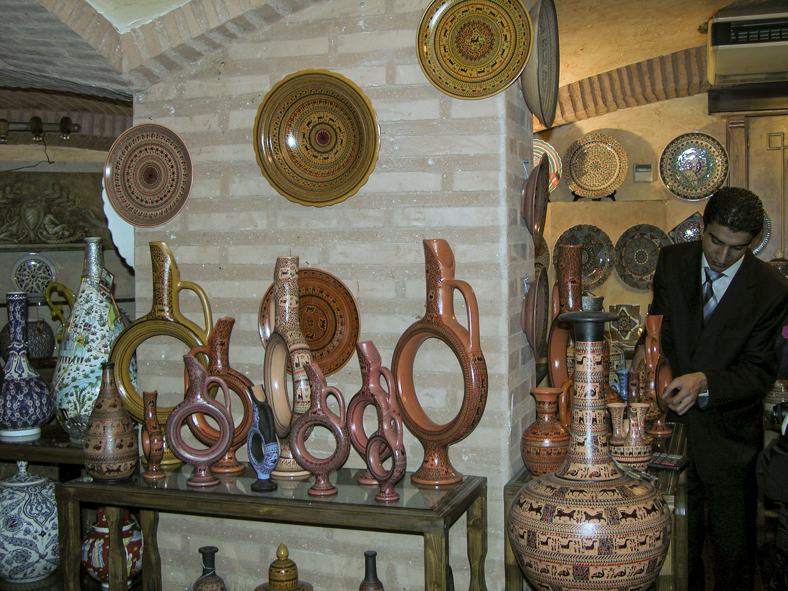
Our next stop after the Basilica Cistern was a real tourist trap, in the best sense of the word – a shop where ceramics of astounding beauty were made, exhibited and sold.
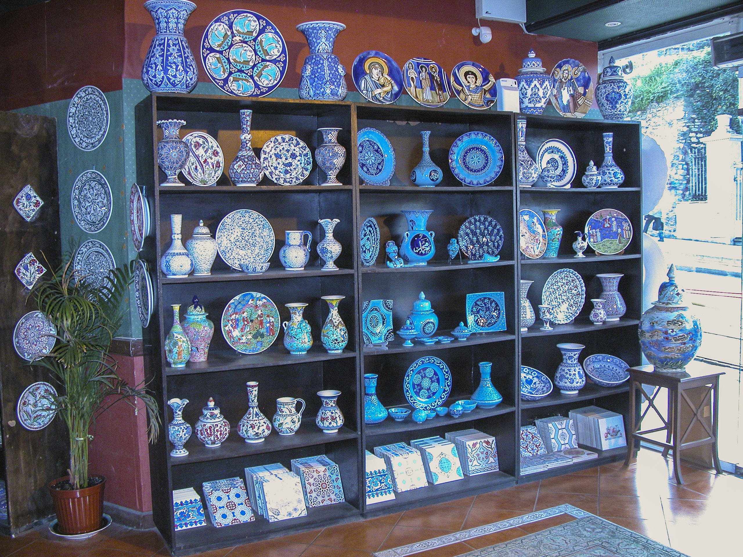
Immediately upon entry, the victim encounters a shelf with a fabulous array of ceramics designed to lure her further into the store.
Every conceivable type of ceramics, with the exception of Space Shuttle heat-resistant tiles, was to be found in this shop.
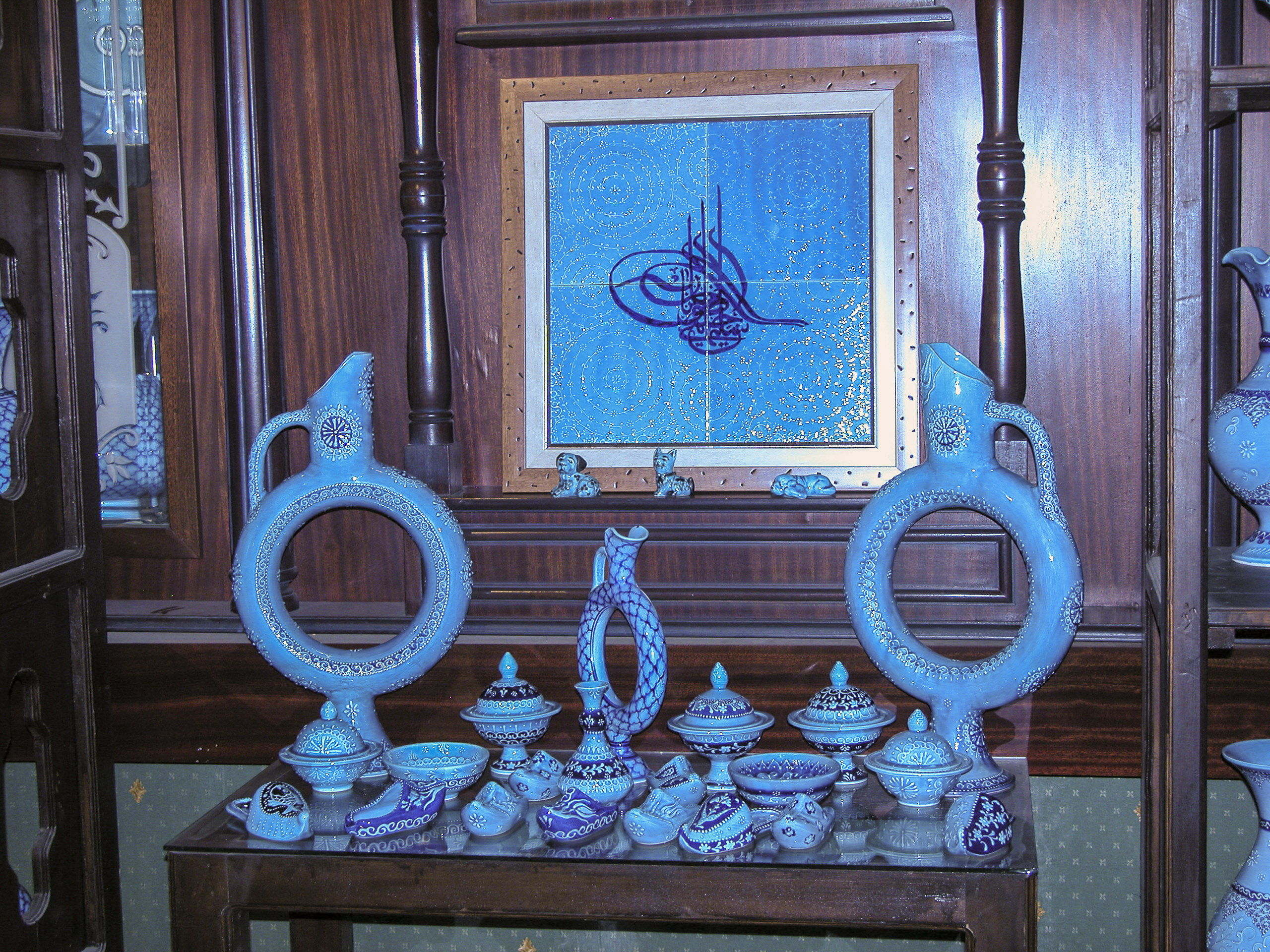
Blue seemed to be the dominant color in the shop’s inventory, and one table featured an exclusive selection of a variety of wares in the same all-blue color scheme, with dark-blue decoration on an iridescent light-blue background.
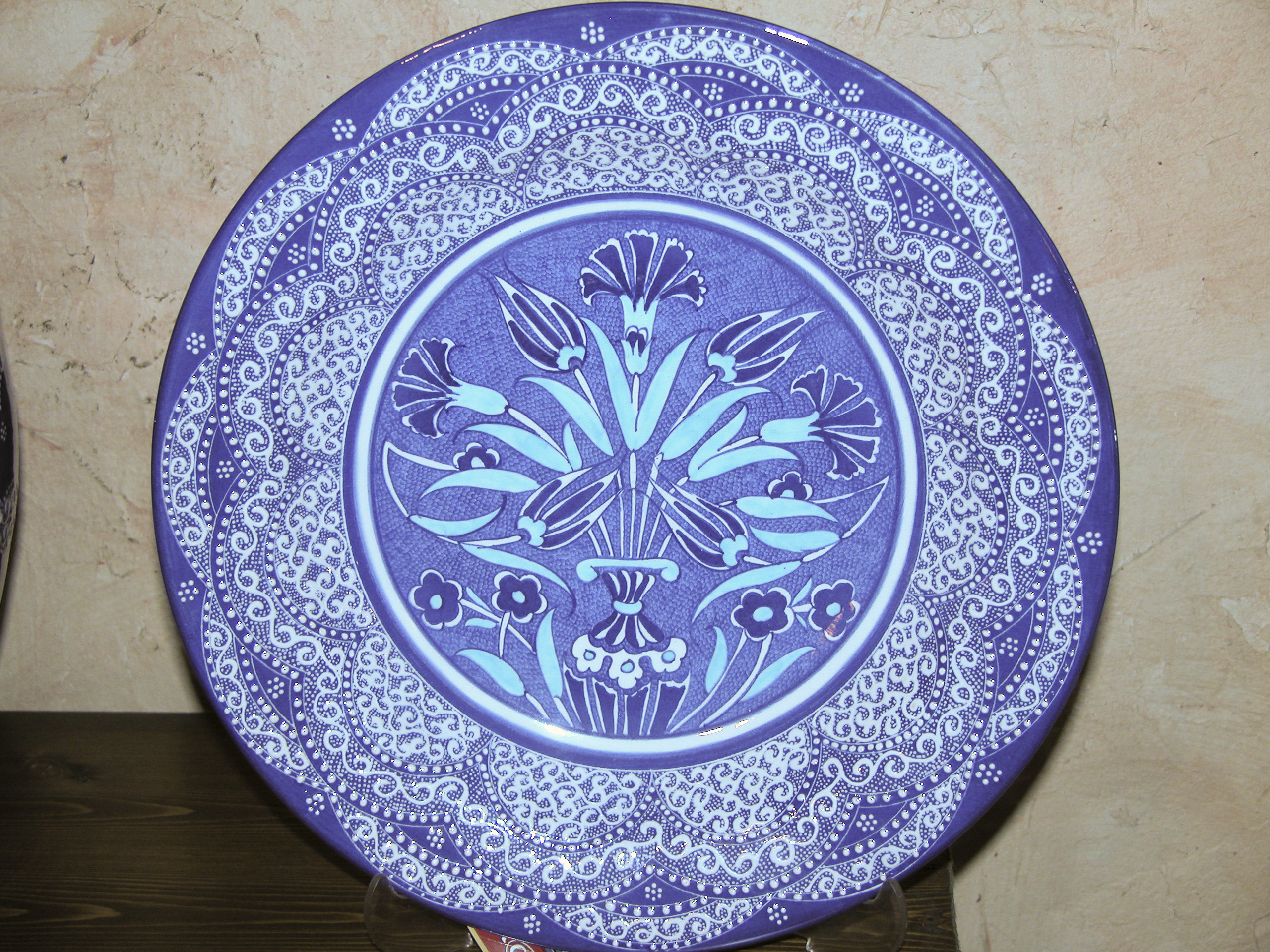
Speaking of blues, I thought this plate would make a fine choice to serve the daily special in a restaurant. (Sorry.)
The platter hanging on the wall in the top center of this frame caught my eye. At first I thought maybe it had been broken during the fabrication process and the potter had decided to make a virtue out of necessity by making both indentations identical, but that seemed unlikely, so I decided that the indentations must have a purpose. Maybe it was intended to make the platter easier to carry. But I never found out for sure.
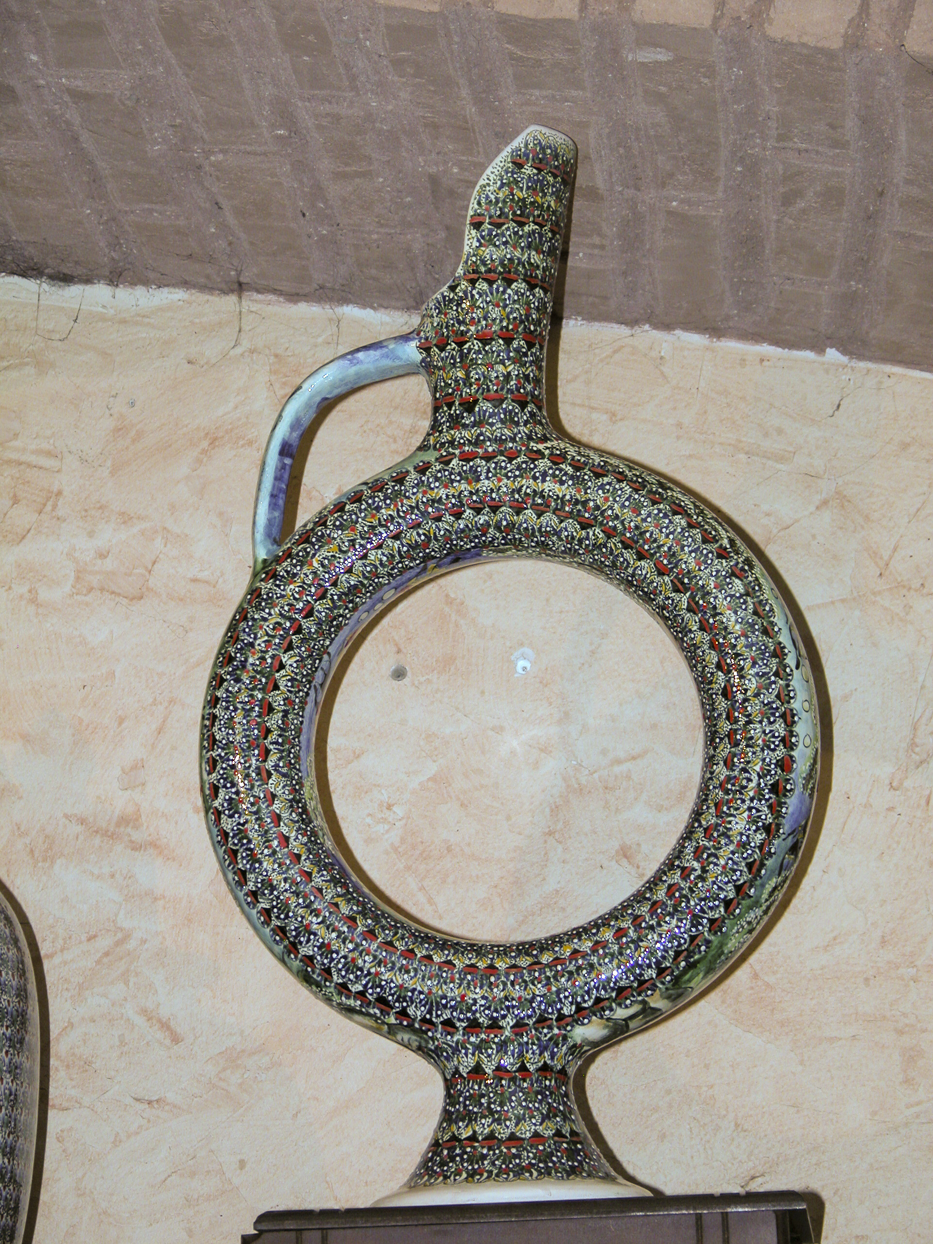
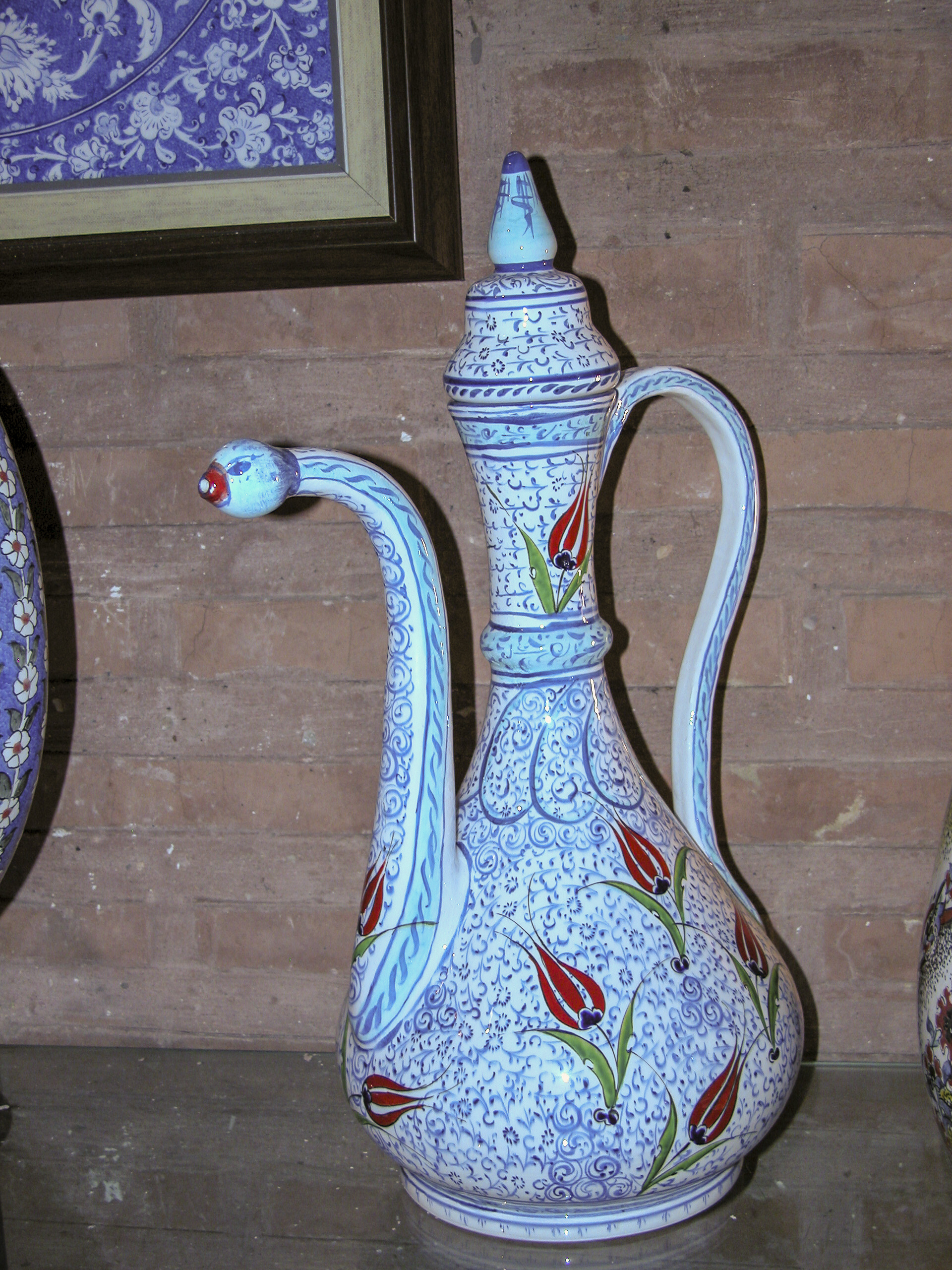
I’ve also never found out the generic name for the type of decanter shown in the next picture. I think the shape is designed to facilitate cooling of the contents. There were many of these in the Istanbul shop, but I’ve never seen them outside of Turkey.
In contrast to the dominant blue, there was one shelf that almost exclusively featured red wares.
Decorative plates and platters were the most abundant item in the shop, and their numbers and variety were overwhelming. The examples on the shelf pictured here featured abstract and floral designs.
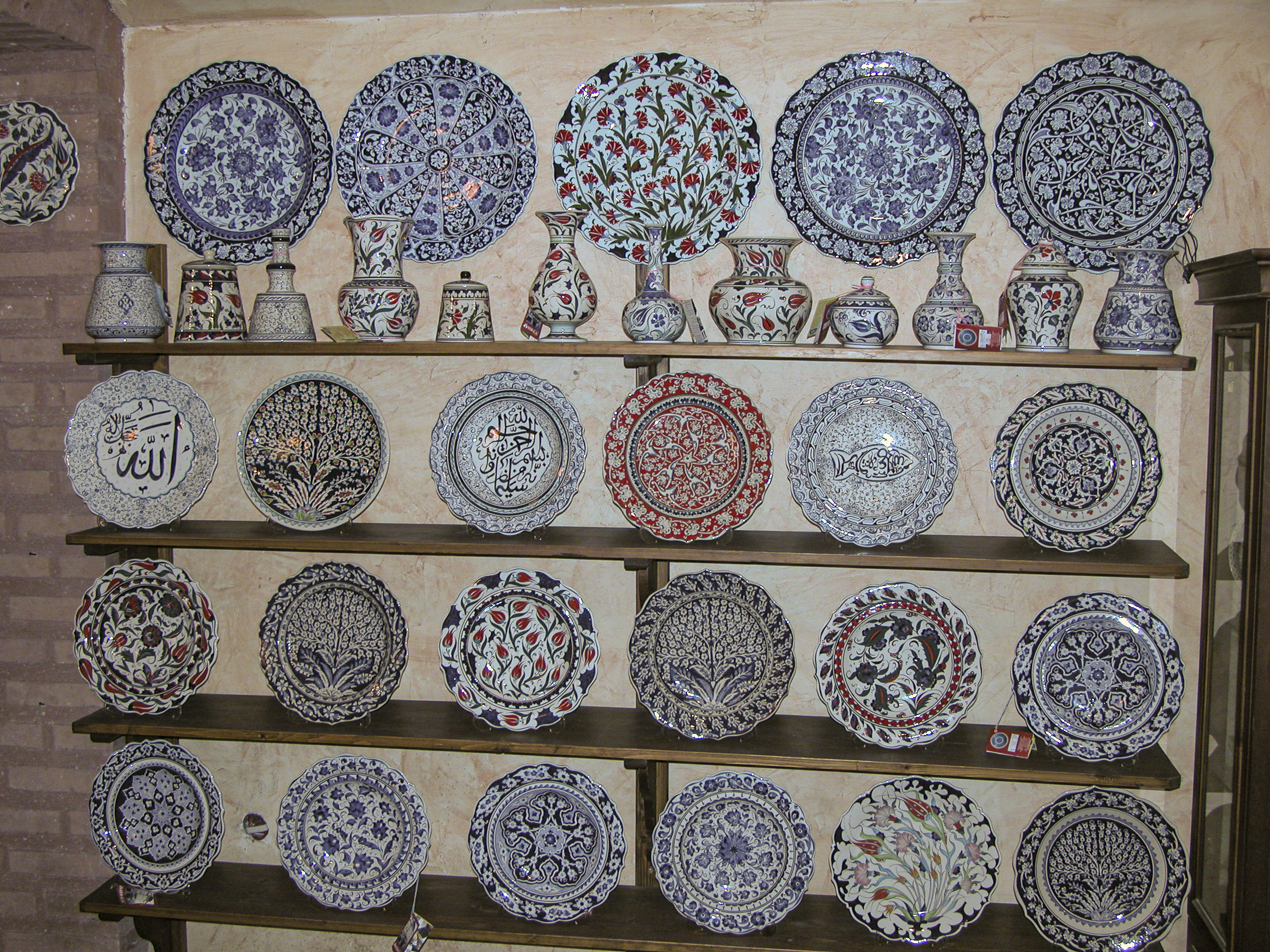
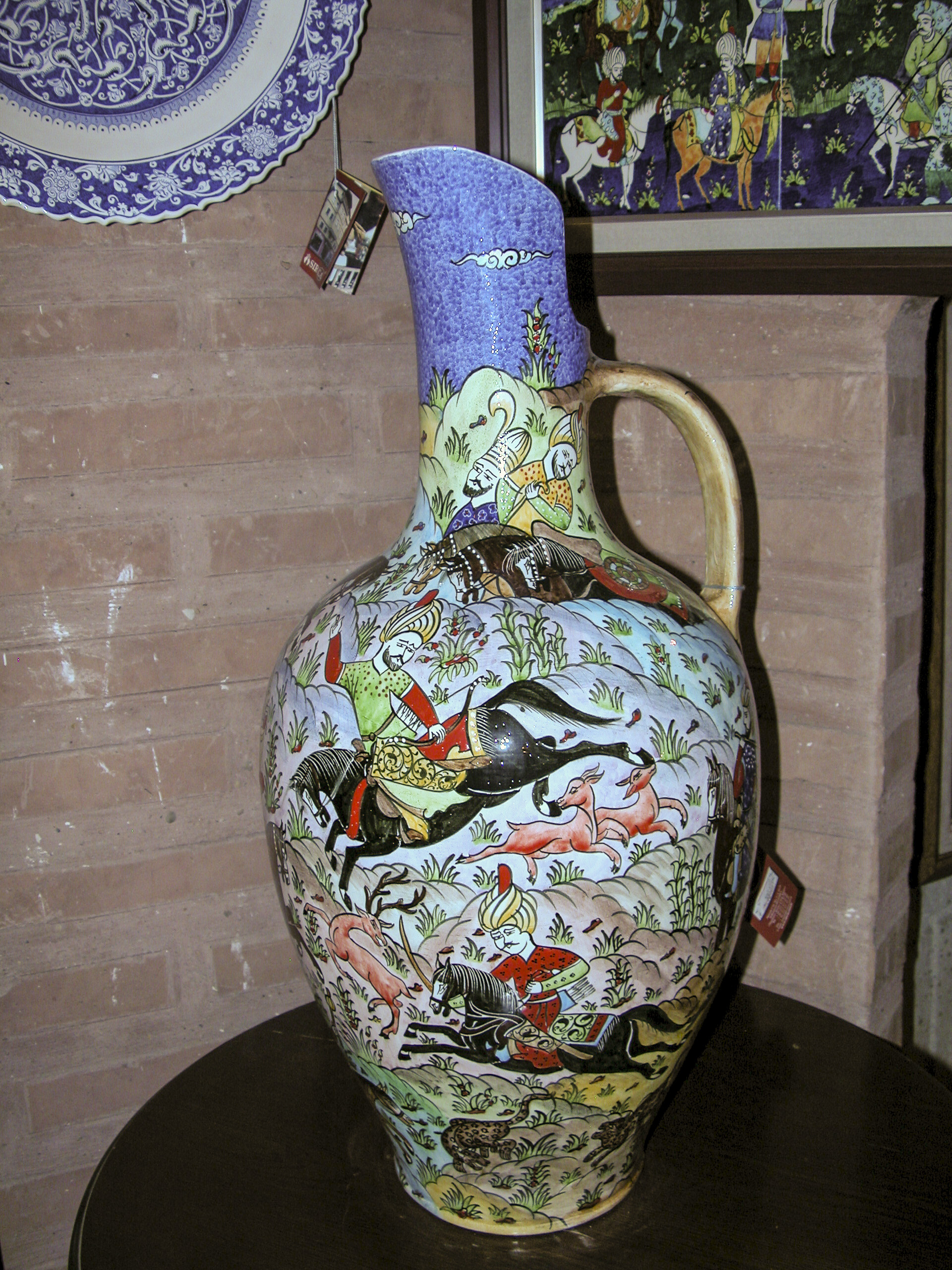
Decorations on the shop’s ceramics consisted of abstract, nautical, floral and terrestrial designs, with abstract motifs probably the most common. Although they were in the minority, a number of plates were decorated with scenes that depicted living beings, including people as well as animals. Knowing that Islam frowns on the artistic representation of living creatures, I assumed that this was a reflection of a typically relaxed Turkish posture in matters of religious doctrine, in keeping with the tolerance of moderate consumption of alcoholic beverages.
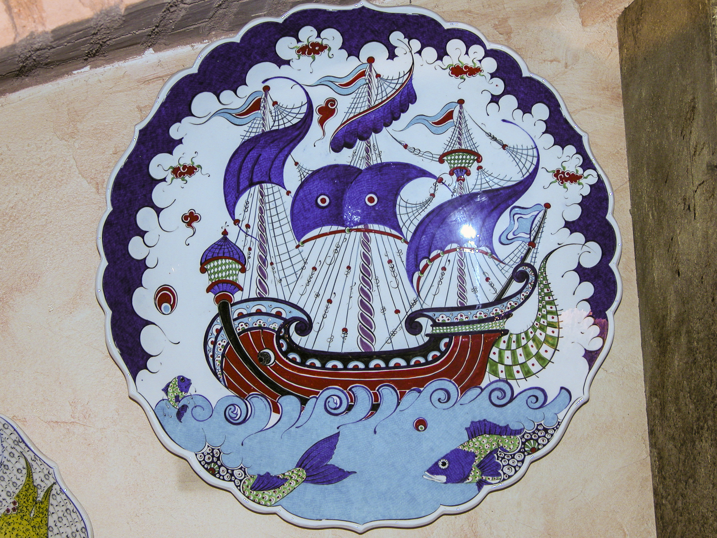
I was particularly captivated by this colorful portrayal of a sailing ship, perhaps carrying Sinbad on one of his voyages.
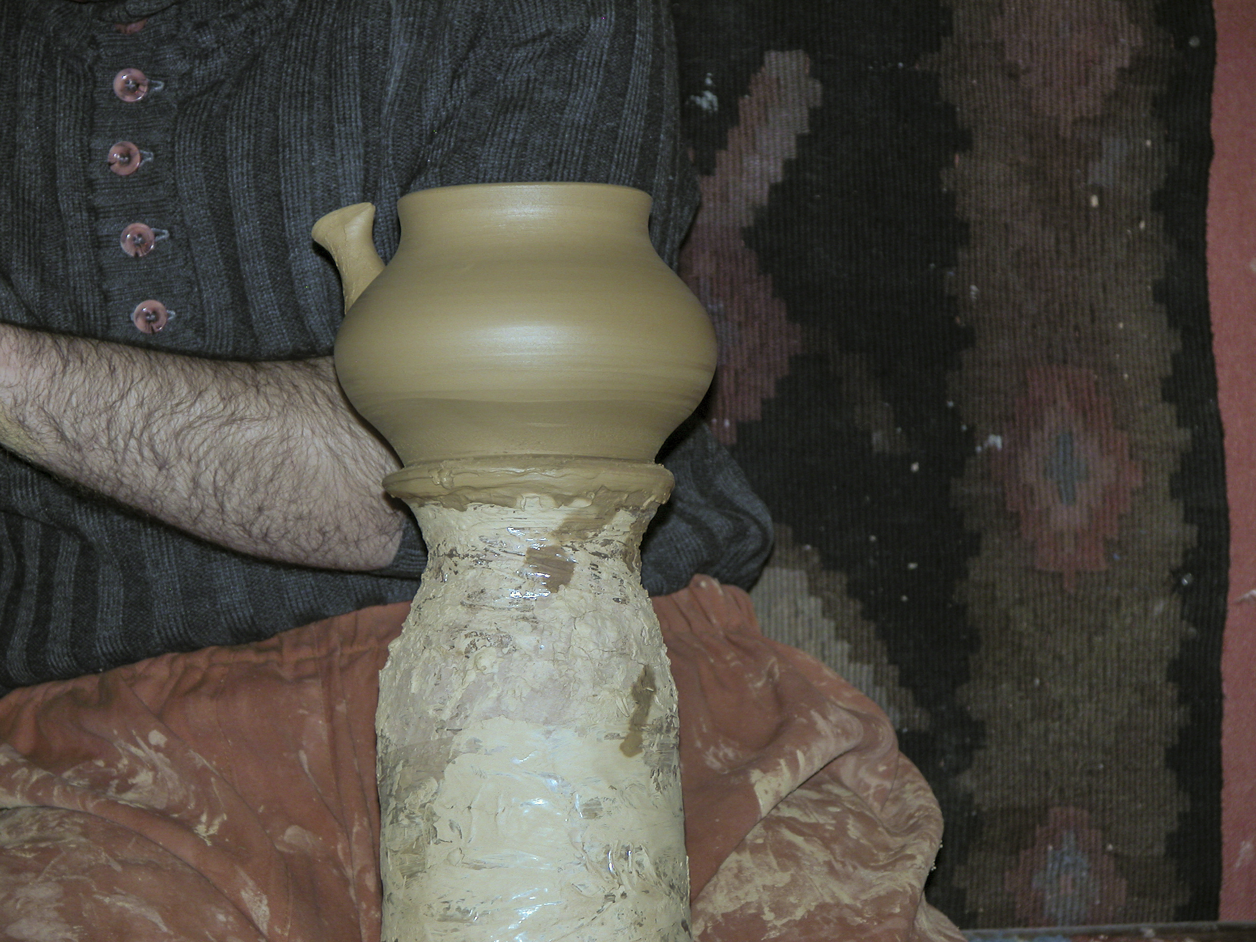
During our visit we were treated to a demonstration of the potter’s art – the creation of a teapot on the wheel. Initially it looked like he was making a flowerpot.
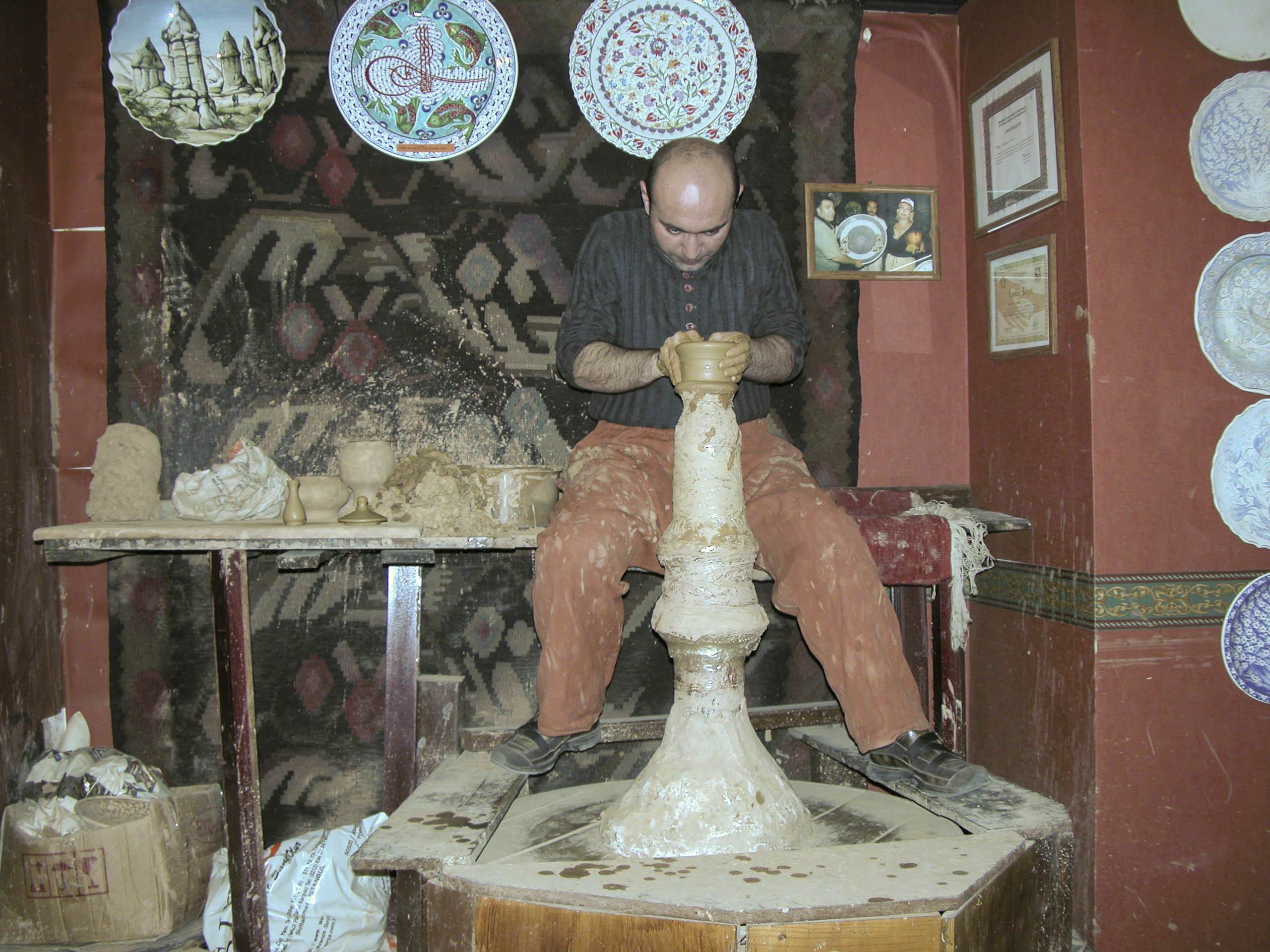
Shortly the vessel gained some curves and began to look like a vase.
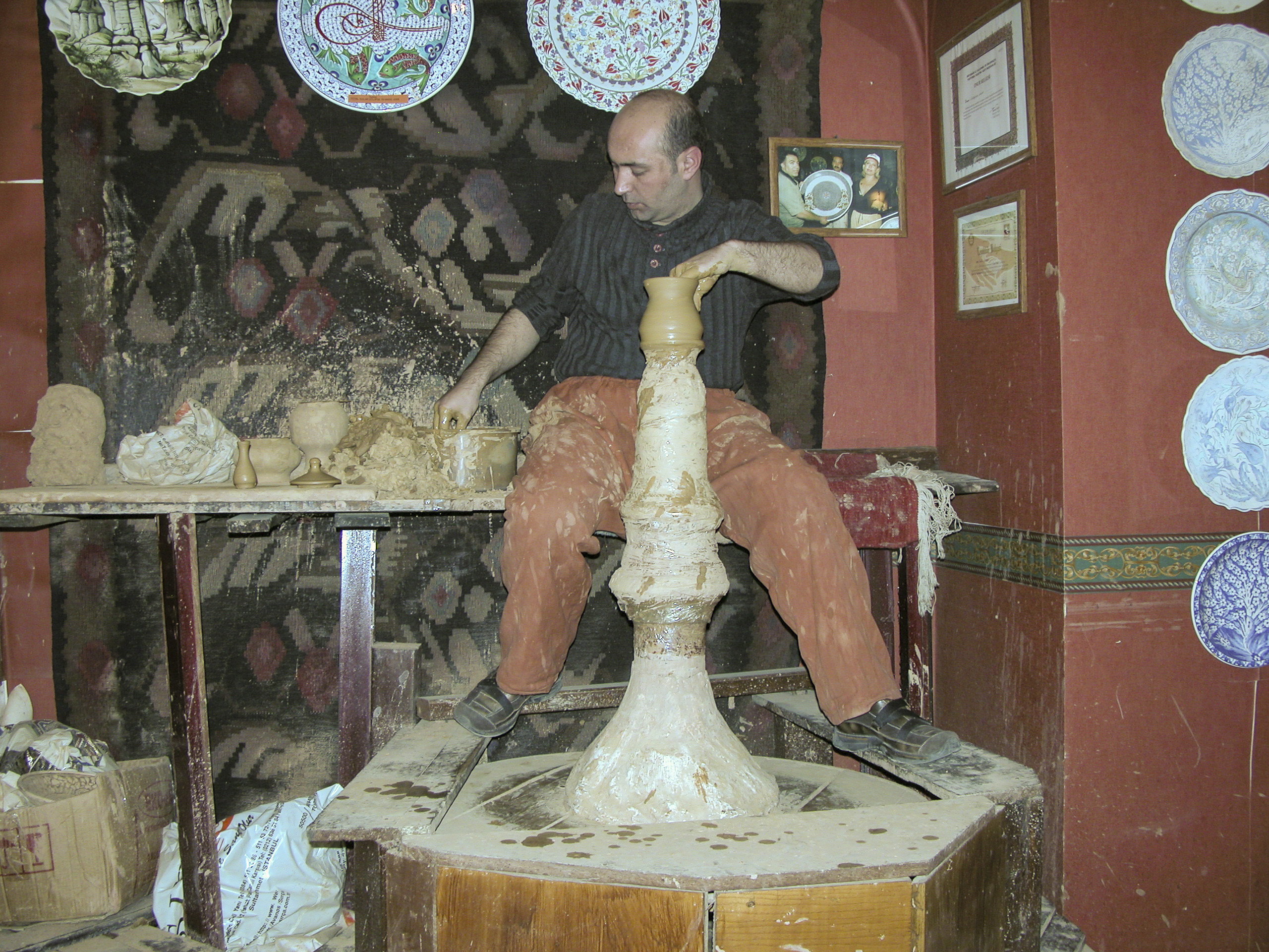
Soon it attained its characteristic shape, fat in the middle and narrower at top and bottom, and then the potter made a spout and prepared to attach it to the teapot, into which he had poked a hole at some point.
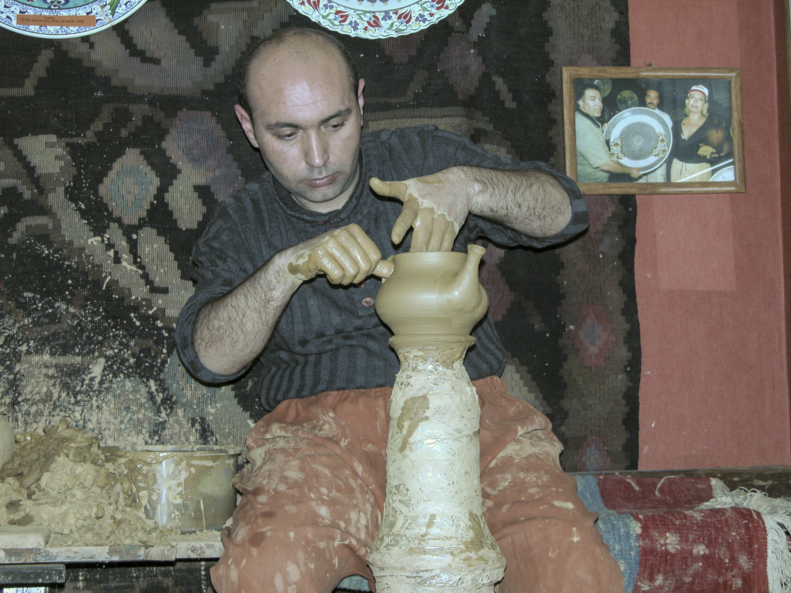
With great care the potter fit the spout to the teapot.
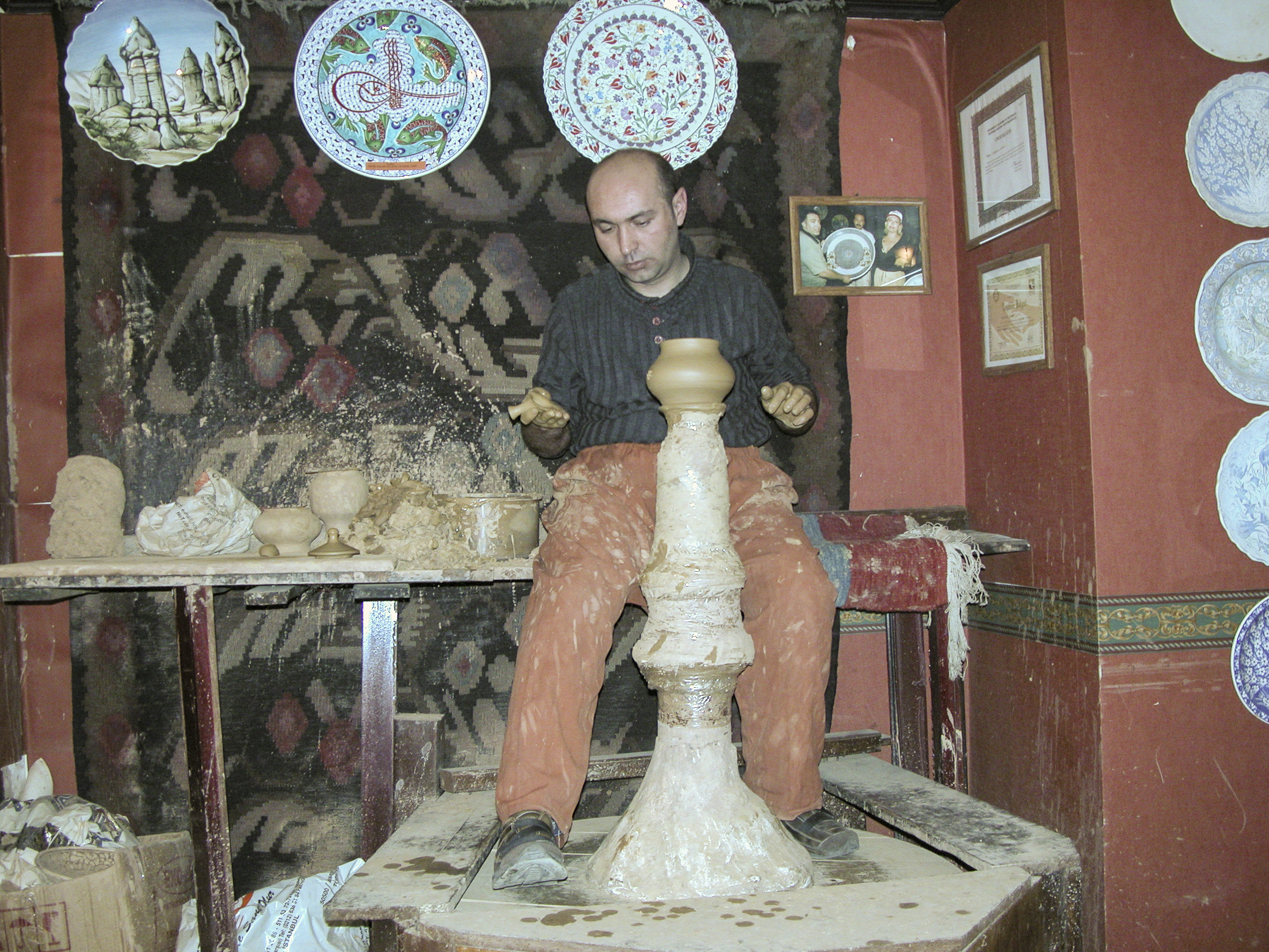
Now it has a spout, but it still needs a handle, not to mention a lid.
Now the potter quickly and deftly shapes a handle and pastes it onto the teapot.
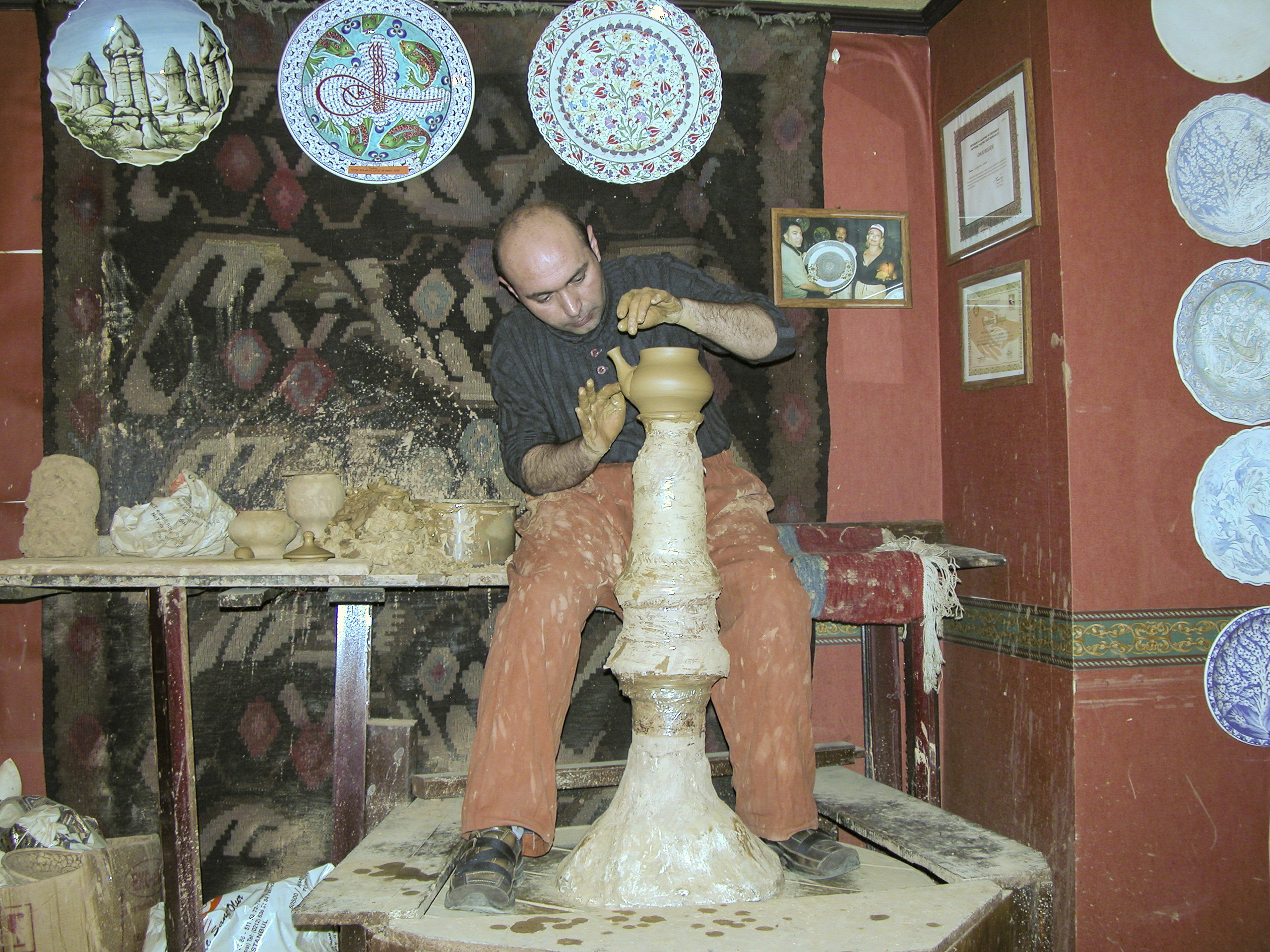
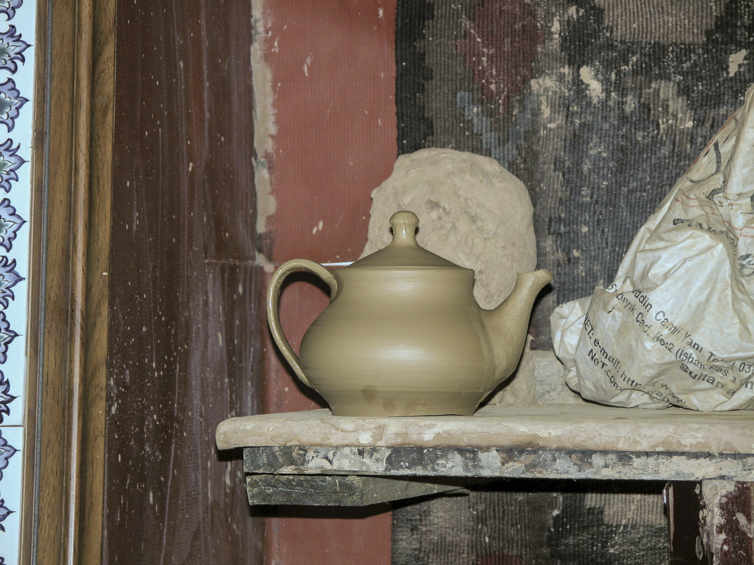
In short order the potter added a lid, and now the teapot was ready for decoration and firing in the kiln. We didn’t get to watch those processes, but we wouldn’t have had the time or the patience anyway. So ended our introduction to this ancient art.
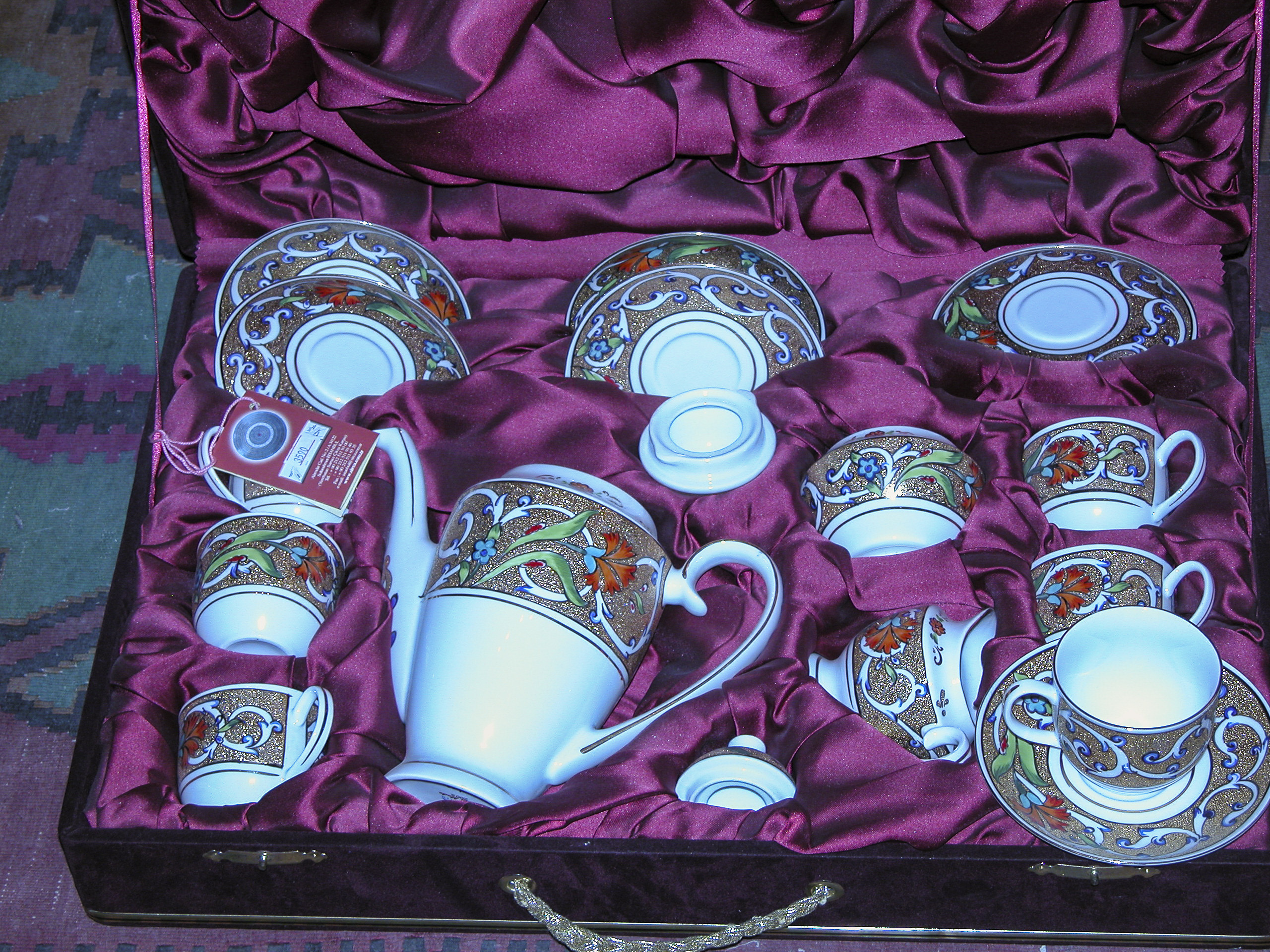
Continuing our rounds of the shop, we came across this beautiful 17-piece tea set, packed in a velvet-lined wooden box.
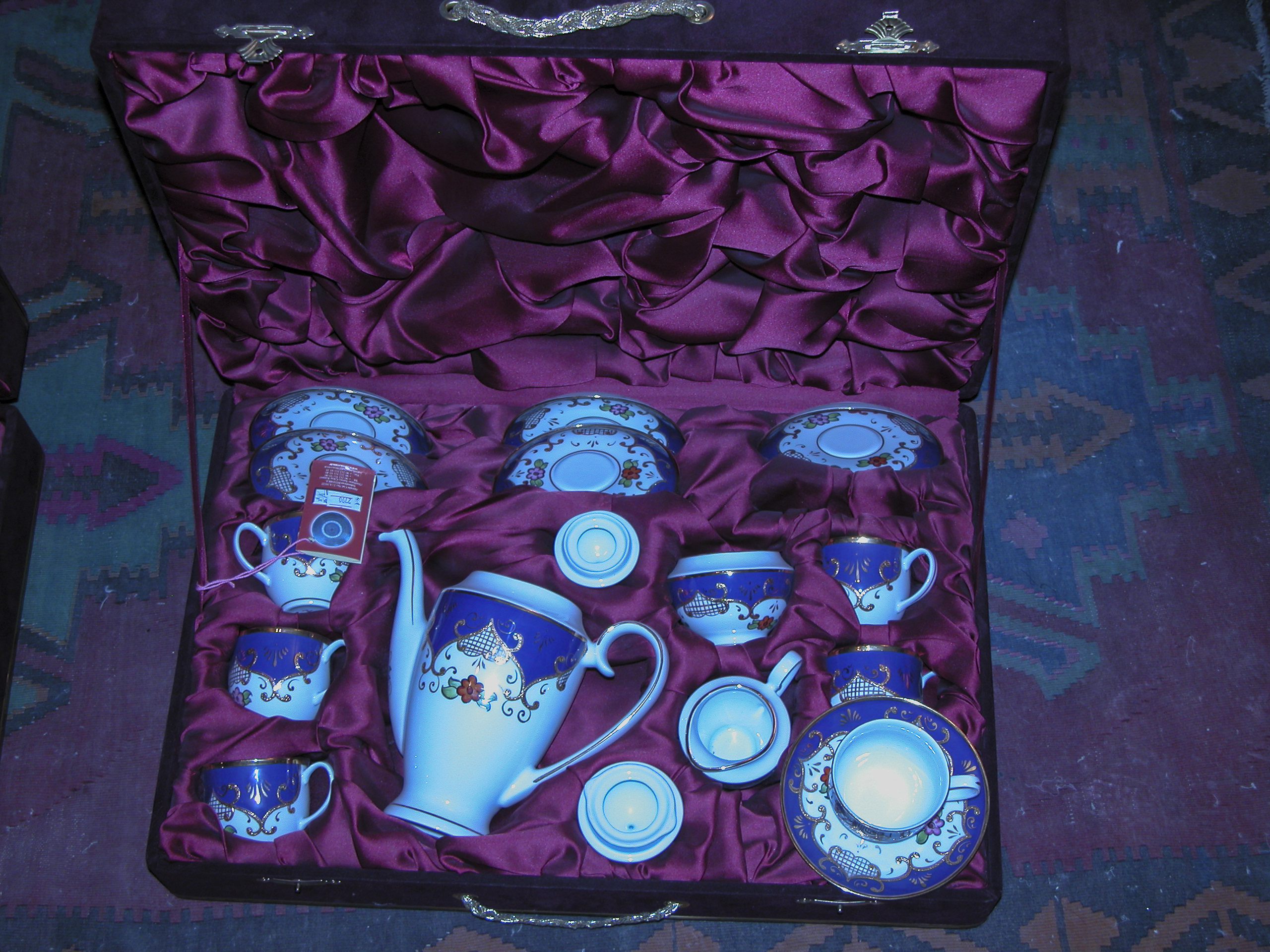
There were several such tea sets, very similar but in different color schemes.
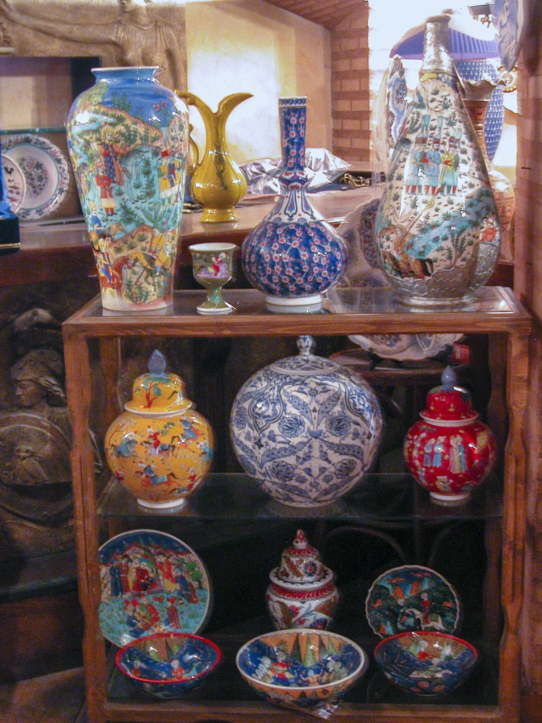
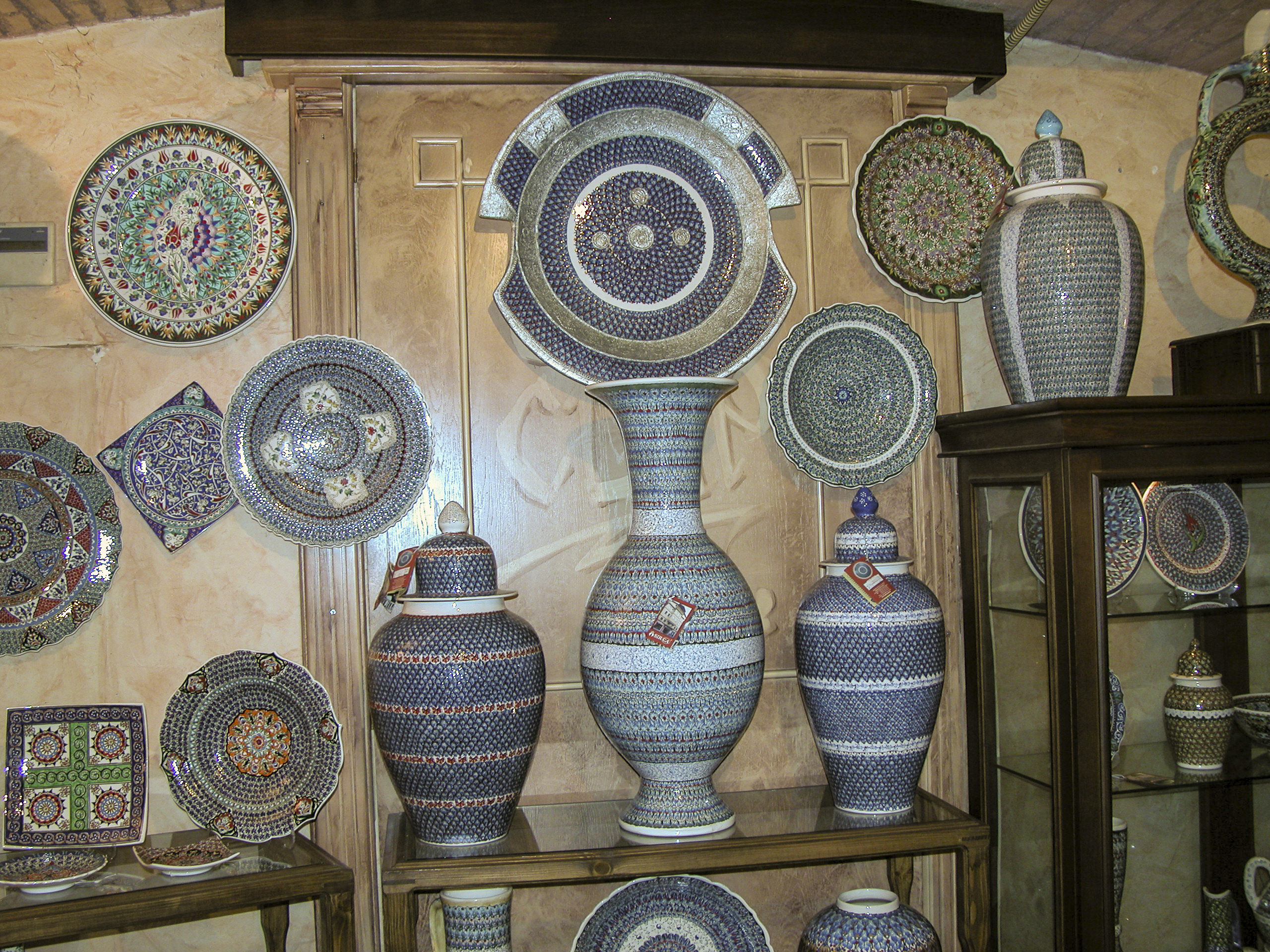
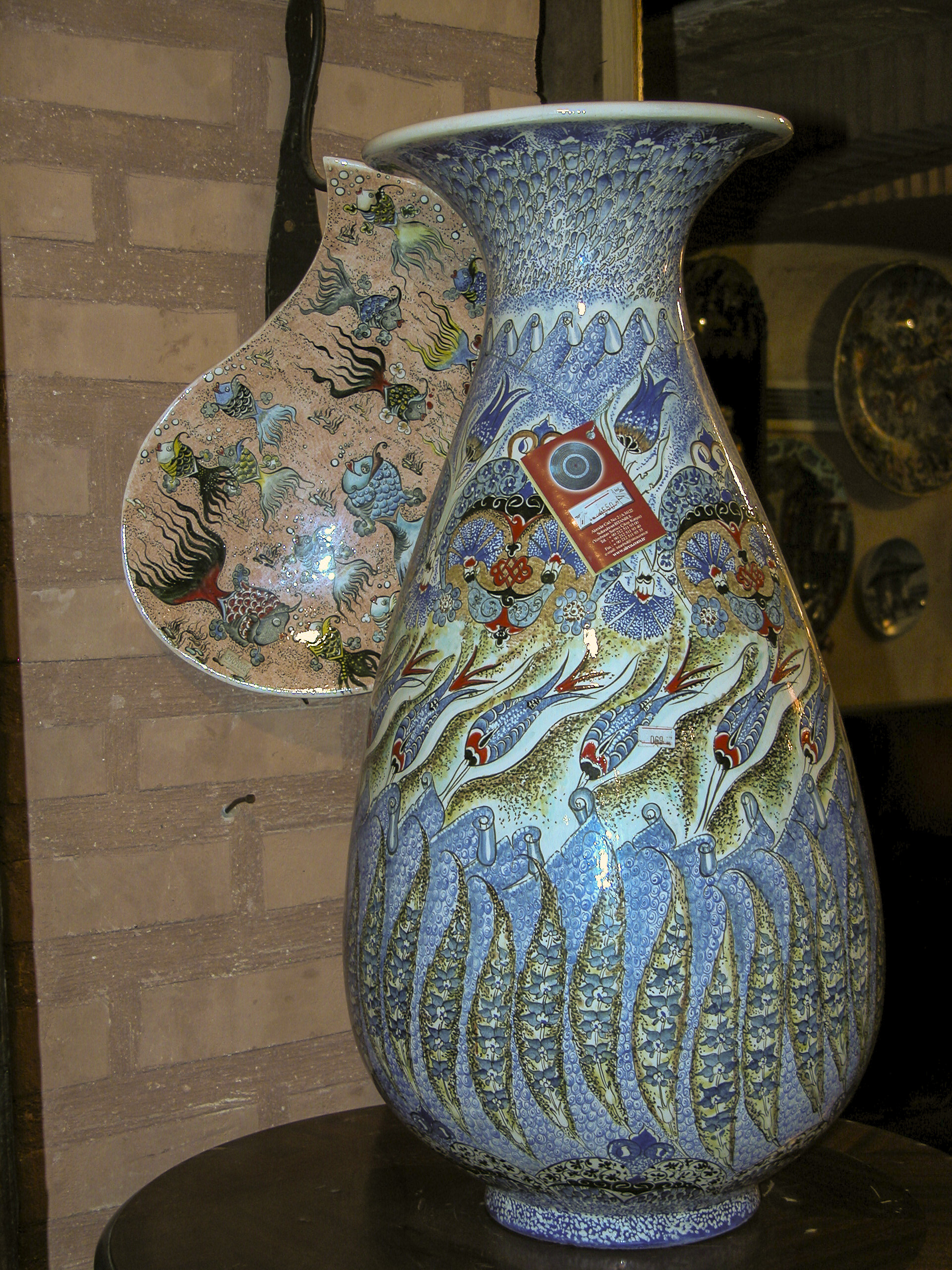
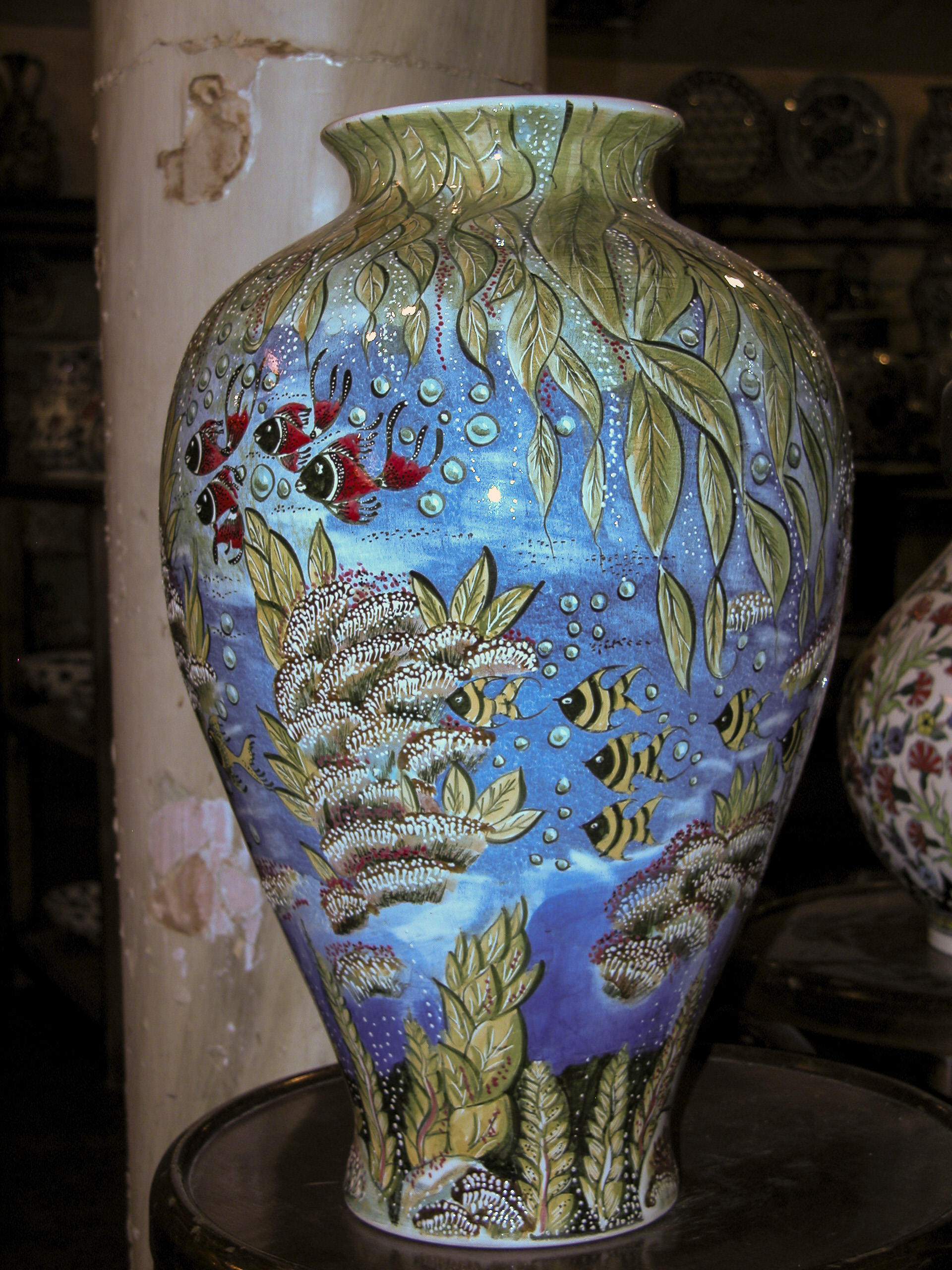
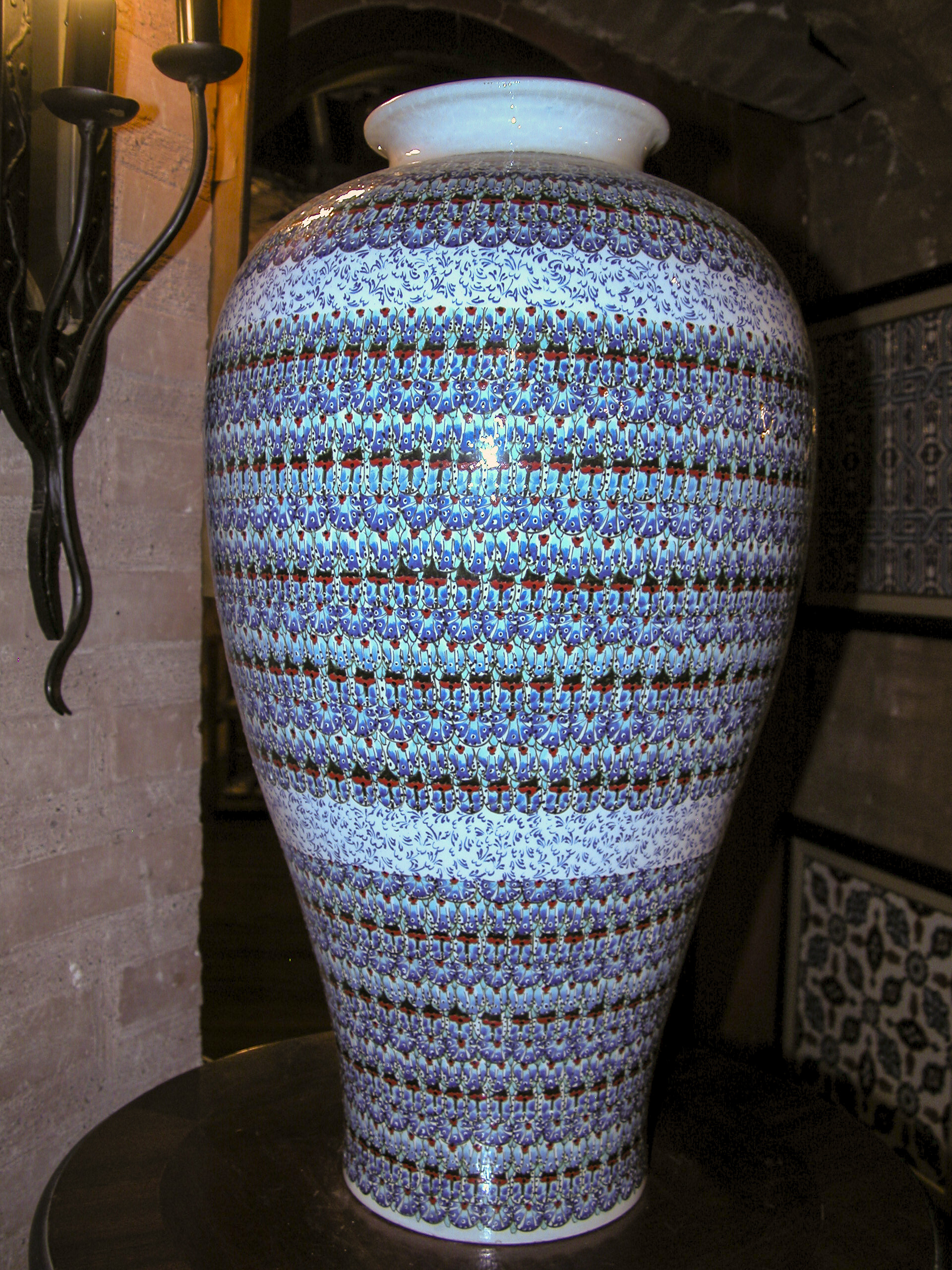
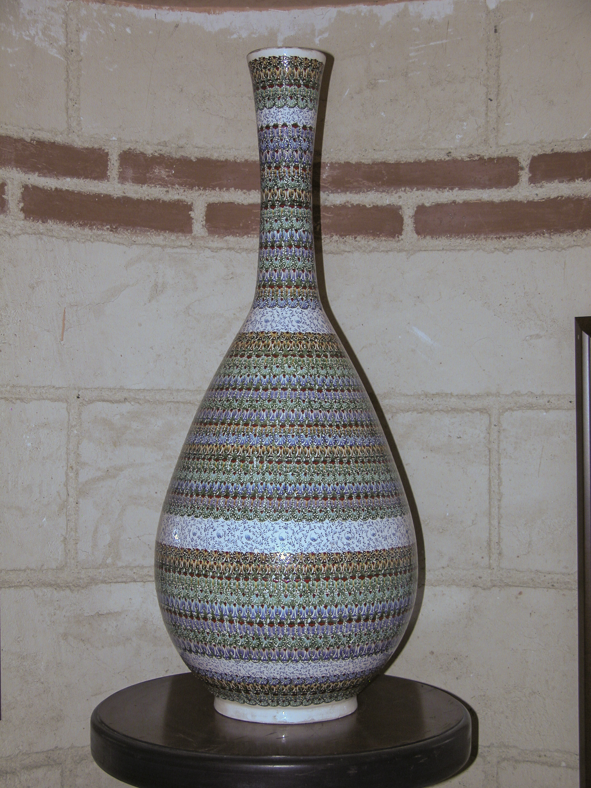
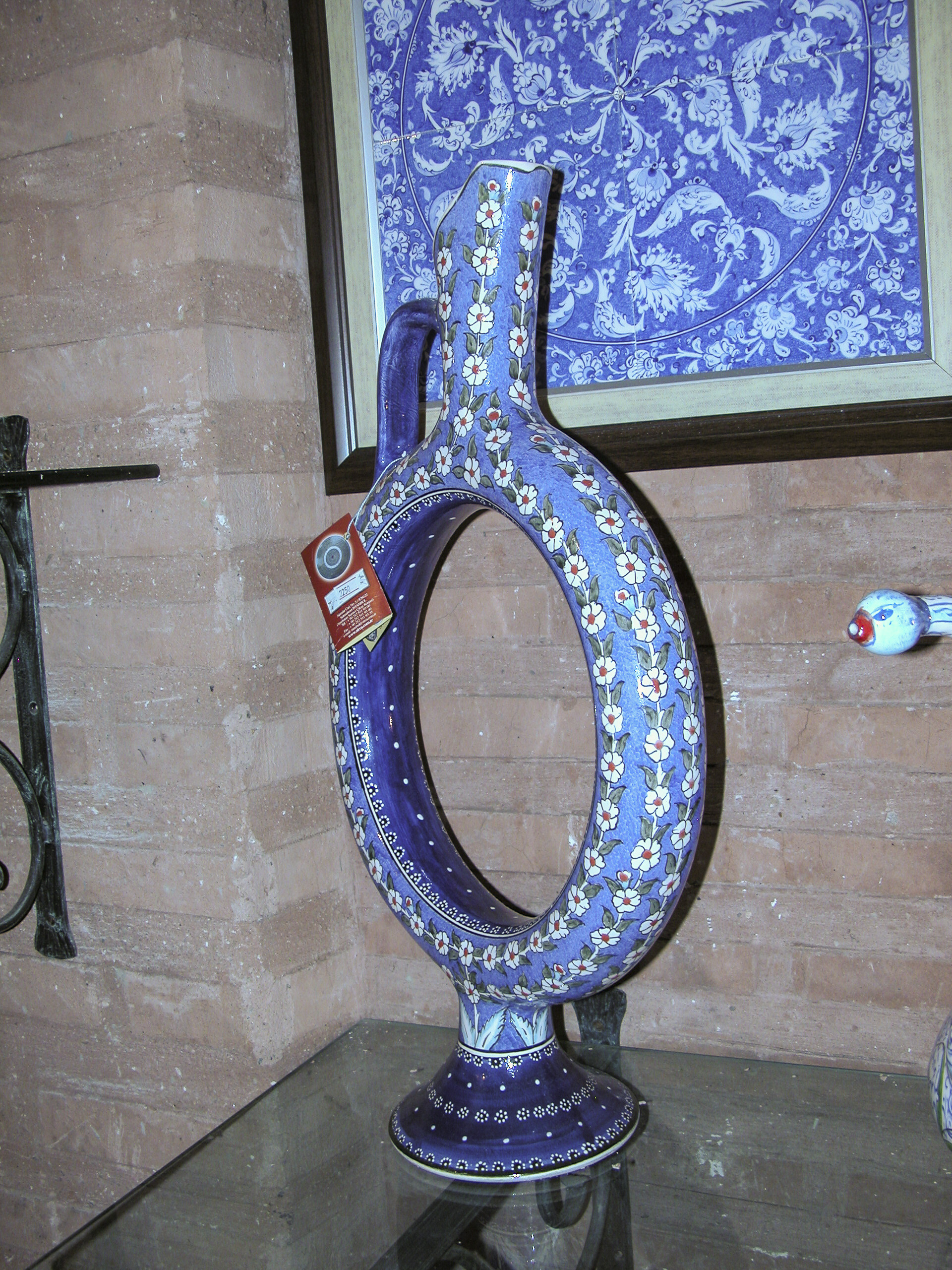
Urns and vases were well-represented among the shop’s wares. Like the plates, many of them featured aquatic and marine motifs.
Some areas in the pottery shop were quite dim, so it was fortunate that my Nikon prosumer camera had a built-in flash. Sandie’s little Canon did not, so she wasn’t able to take many pictures in the pottery shop.
I loved the elaborate shape, complemented by the simple but exquisite floral decoration, of this elegant Turkish coffeepot.
Next to the Turkish coffeepot was a blue wine decanter, with a painting of somewhat similar color scheme on the wall behind it. Clearly they were hoping to sell these as a pair.
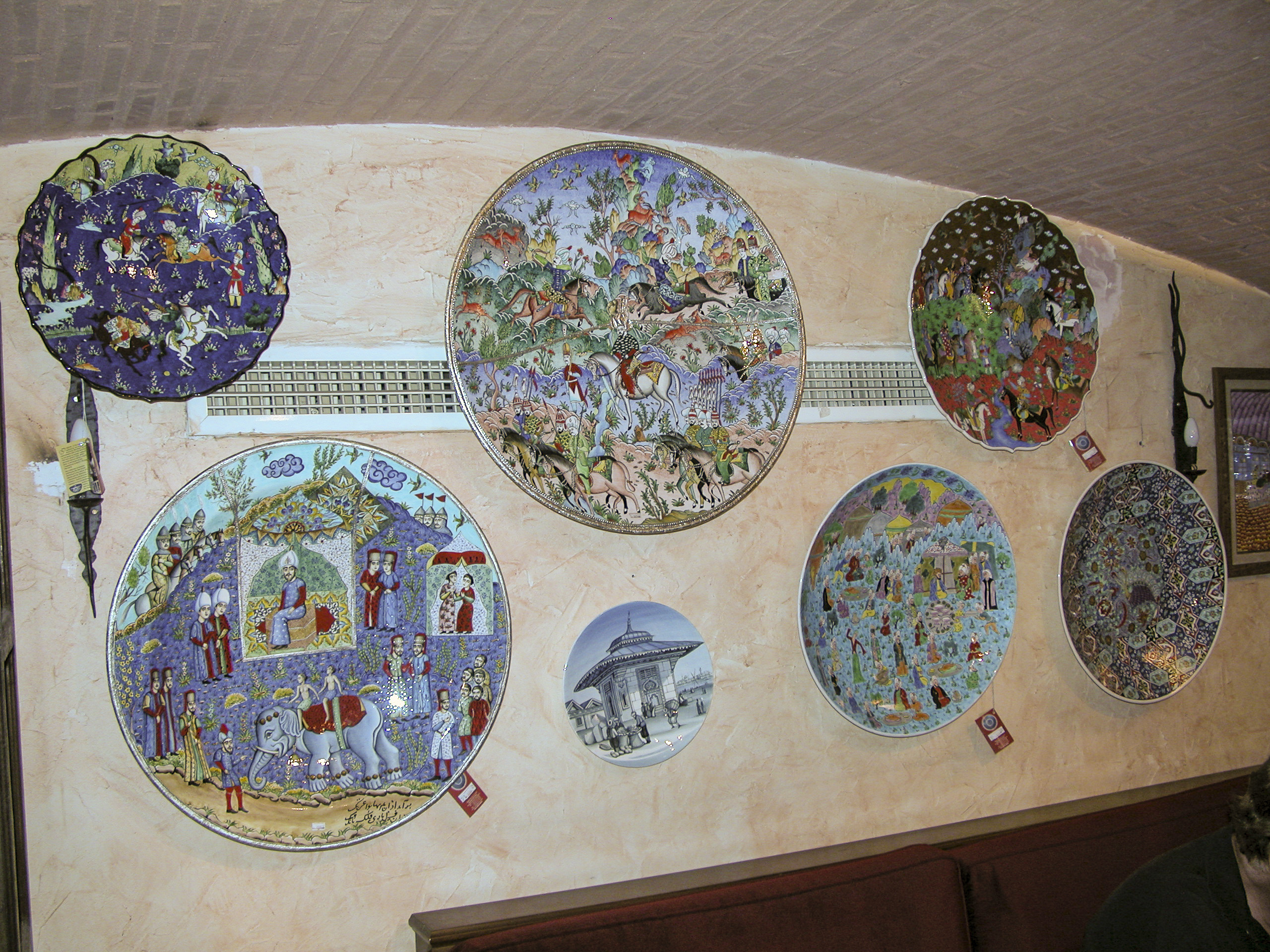
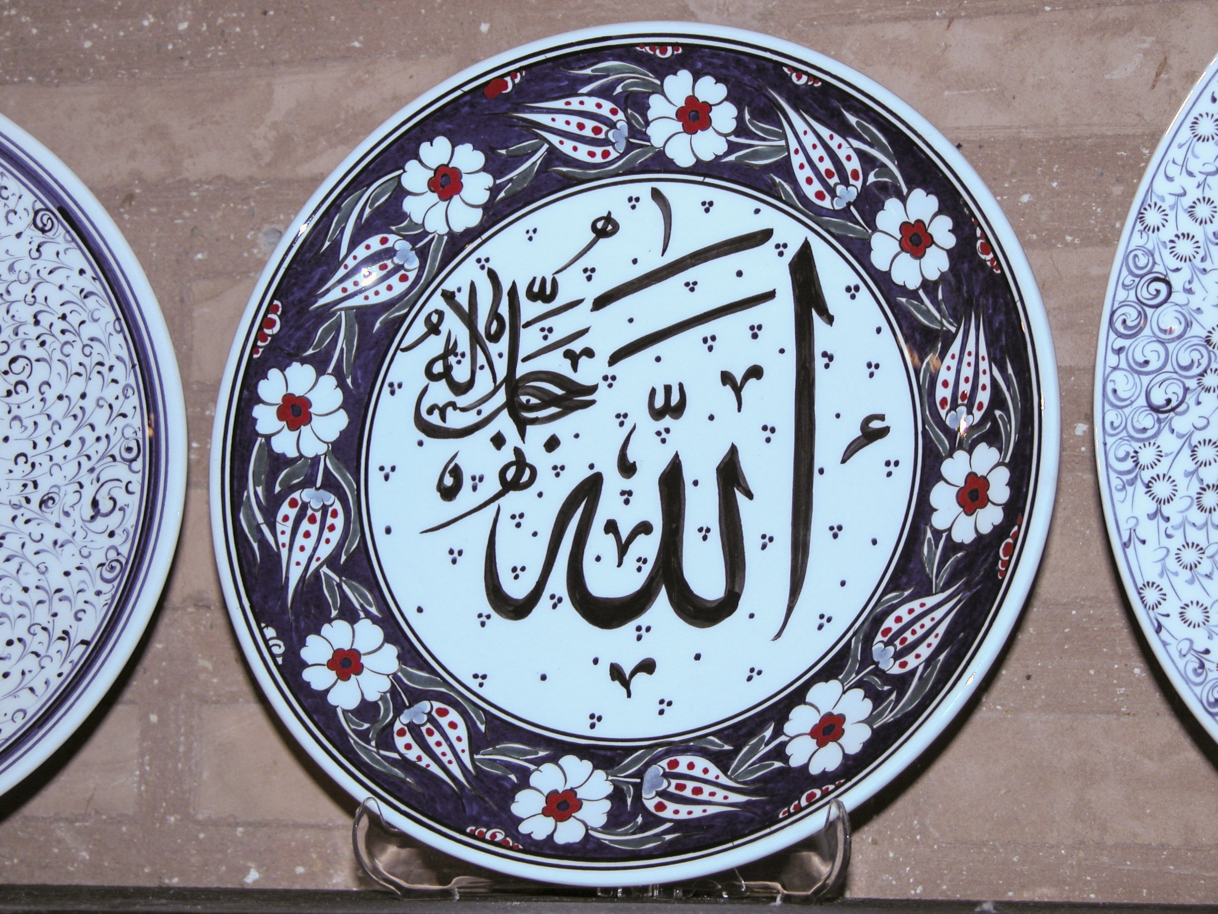
Returning to the plate department, I greatly enjoyed the elegant stylized Arabic script decorating these next three, although for all I know it may say something like “Death to Infidels” or “You are the illegitimate offspring of an unholy union between a donkey and a camel.”
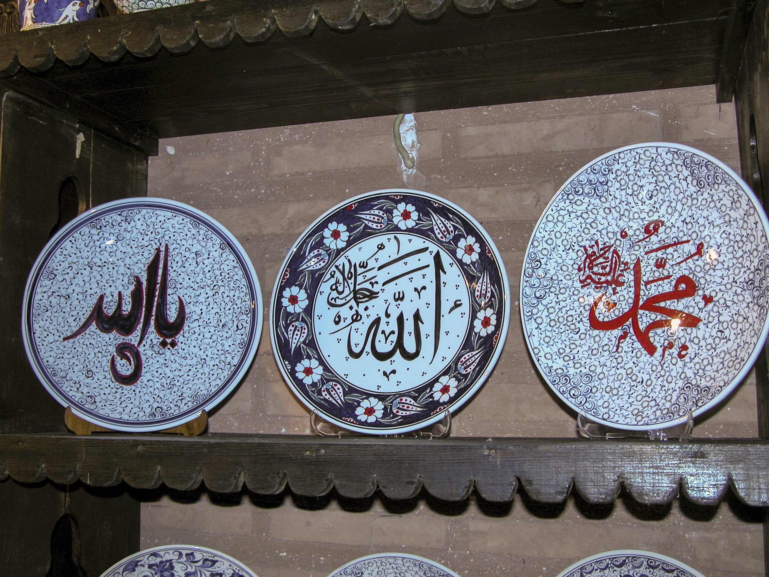
Of the three plates on this shelf, my favorite combined a floral design with what appears to be a mishmash of Arabic script and Greek letters.
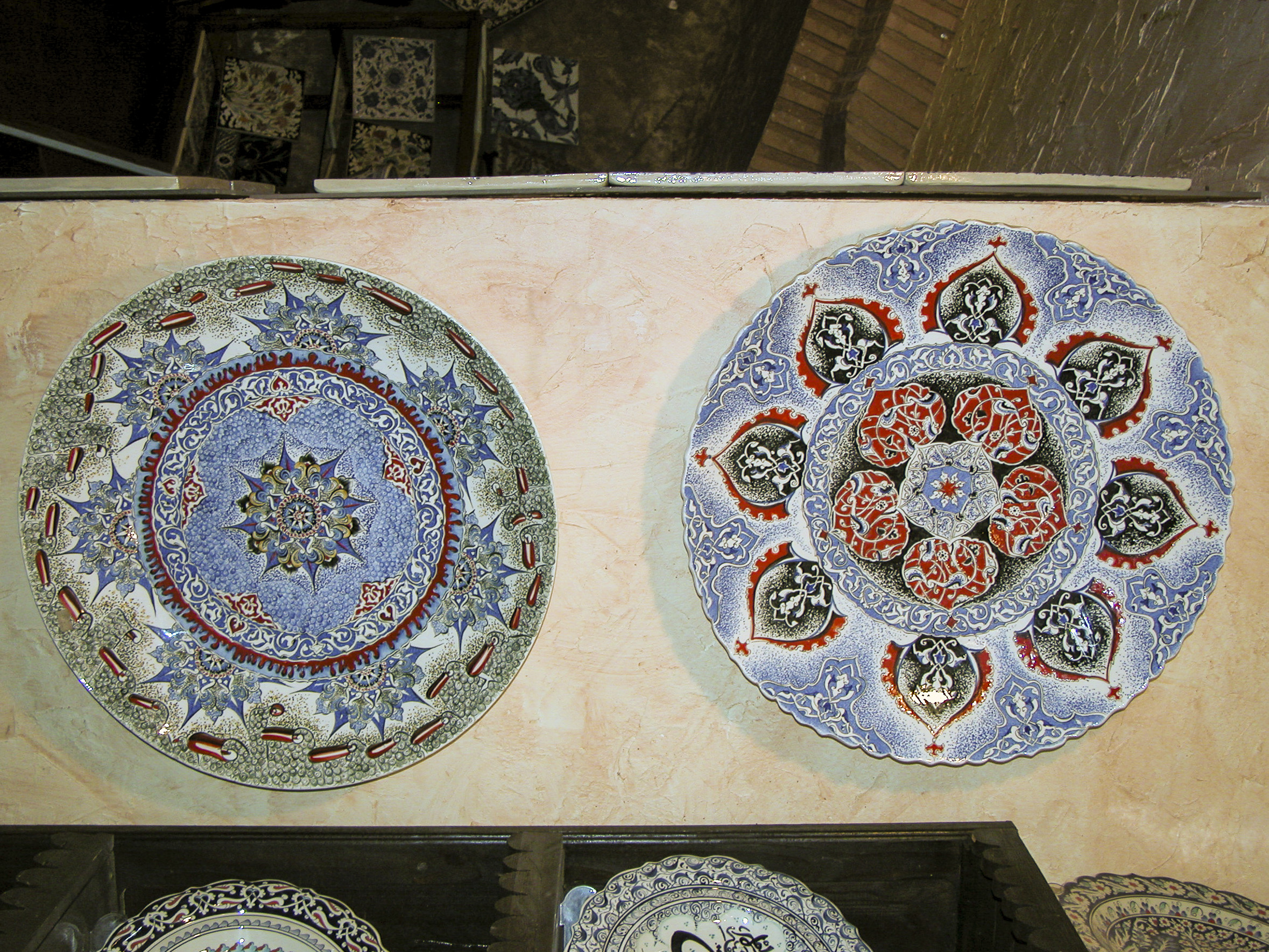
But for me, still more pleasing were the intricate abstract patterns on the two items shown below.
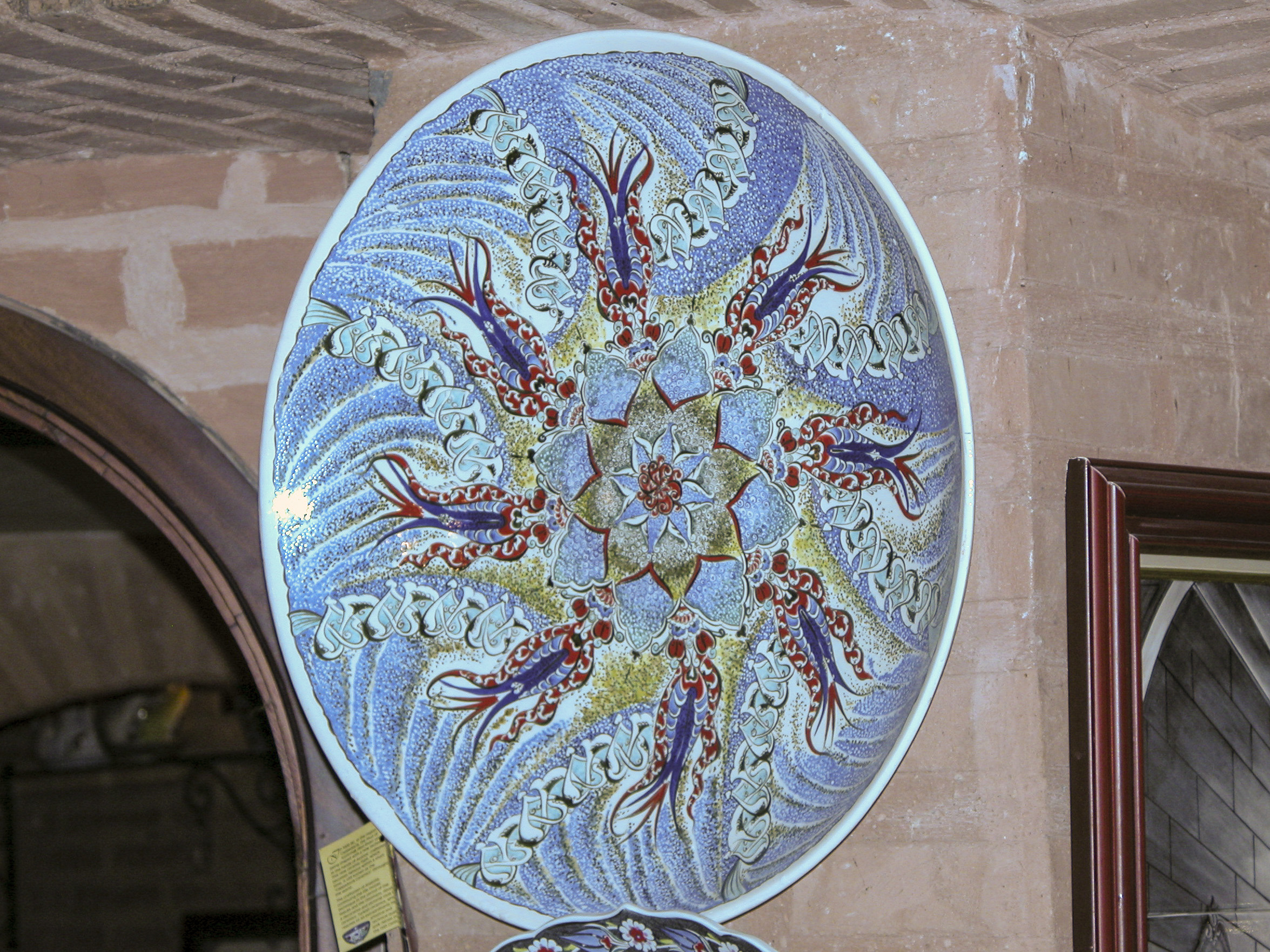
I’m not sure what sort of creatures the artist intended to represent here, but the juxtaposition of the animal and floral life was superbly executed.
This room featured a wide variety of ceramics, including the hexagonal tiles, which I saw few of elsewhere. Rather at odds with the rest of the display is the cheap-looking faux-marble Ionic column in the center, which appears to be an unfinished, ill-conceived and poorly integrated addition to the room.
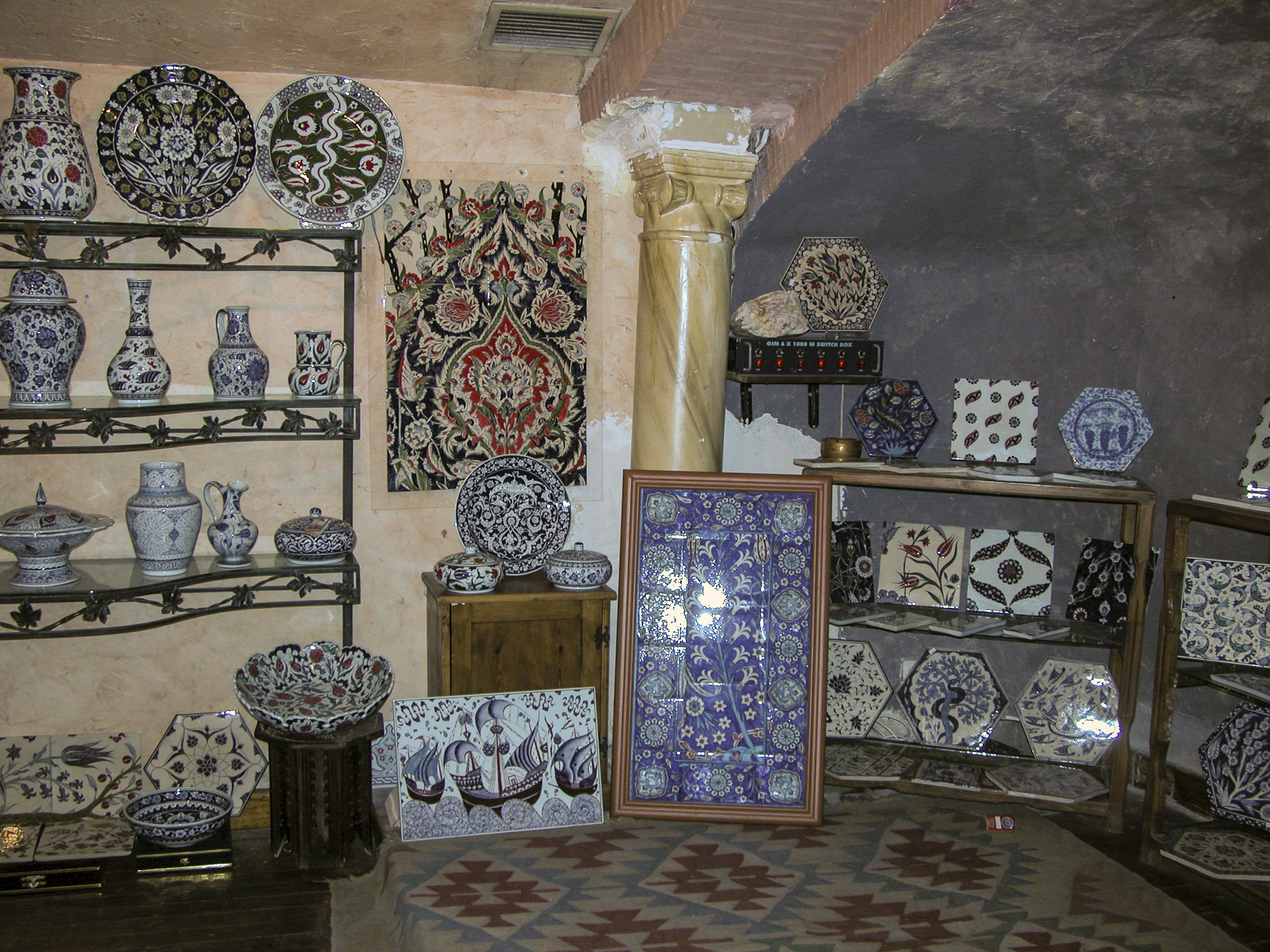
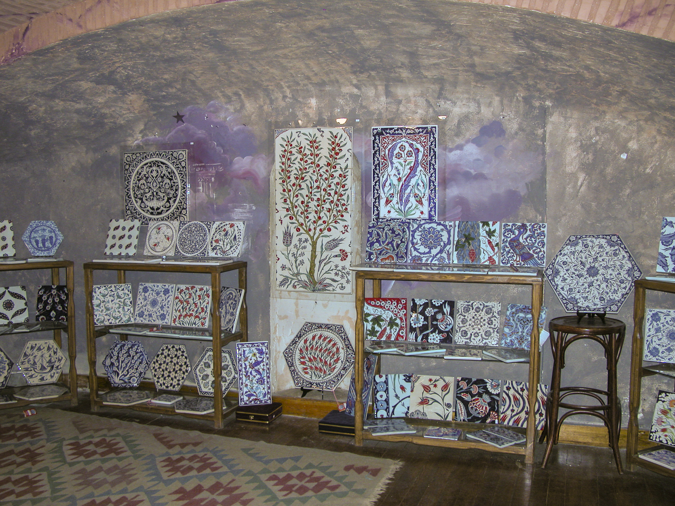
Ceramic tiles are my preferred choice for flooring as well as bathroom and kitchen surfaces, and this shop had an excellent selection. I would gladly have any or all of them in my house – if I could afford them, which would be unlikely.
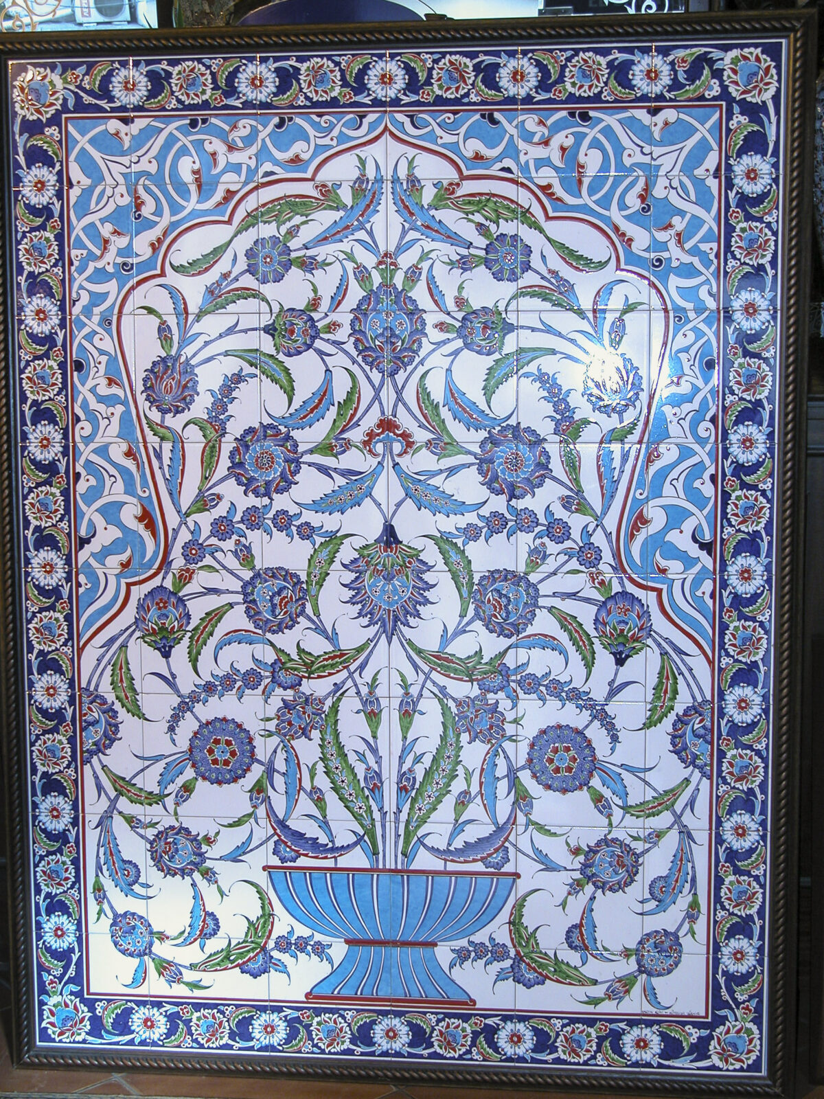
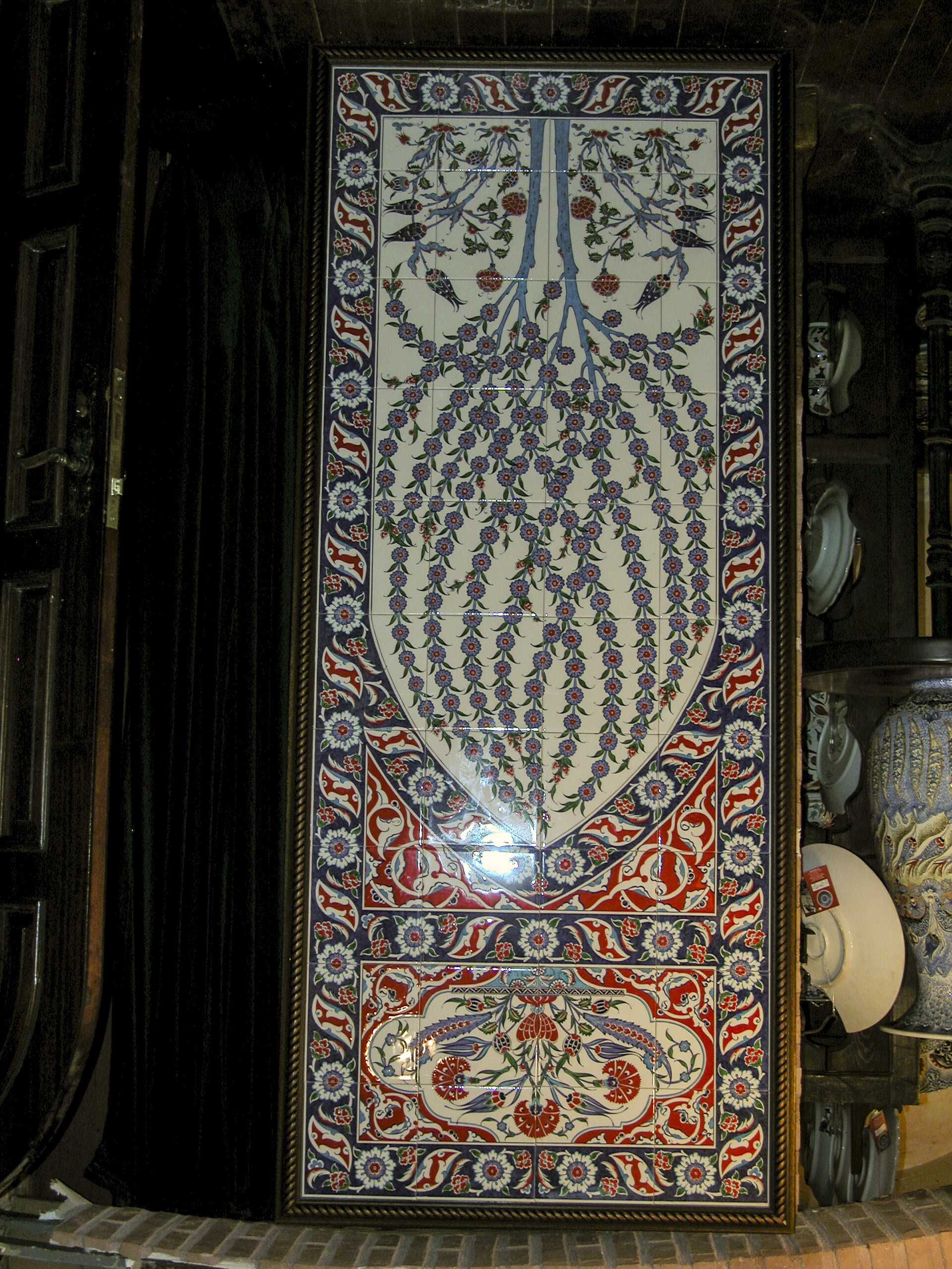
I don’t know whether there is a specialized term that applies to this type of composite-tile panel, so I just call it a “tile mosaic.” Regardless, I found this a particularly pleasing example of the genre.
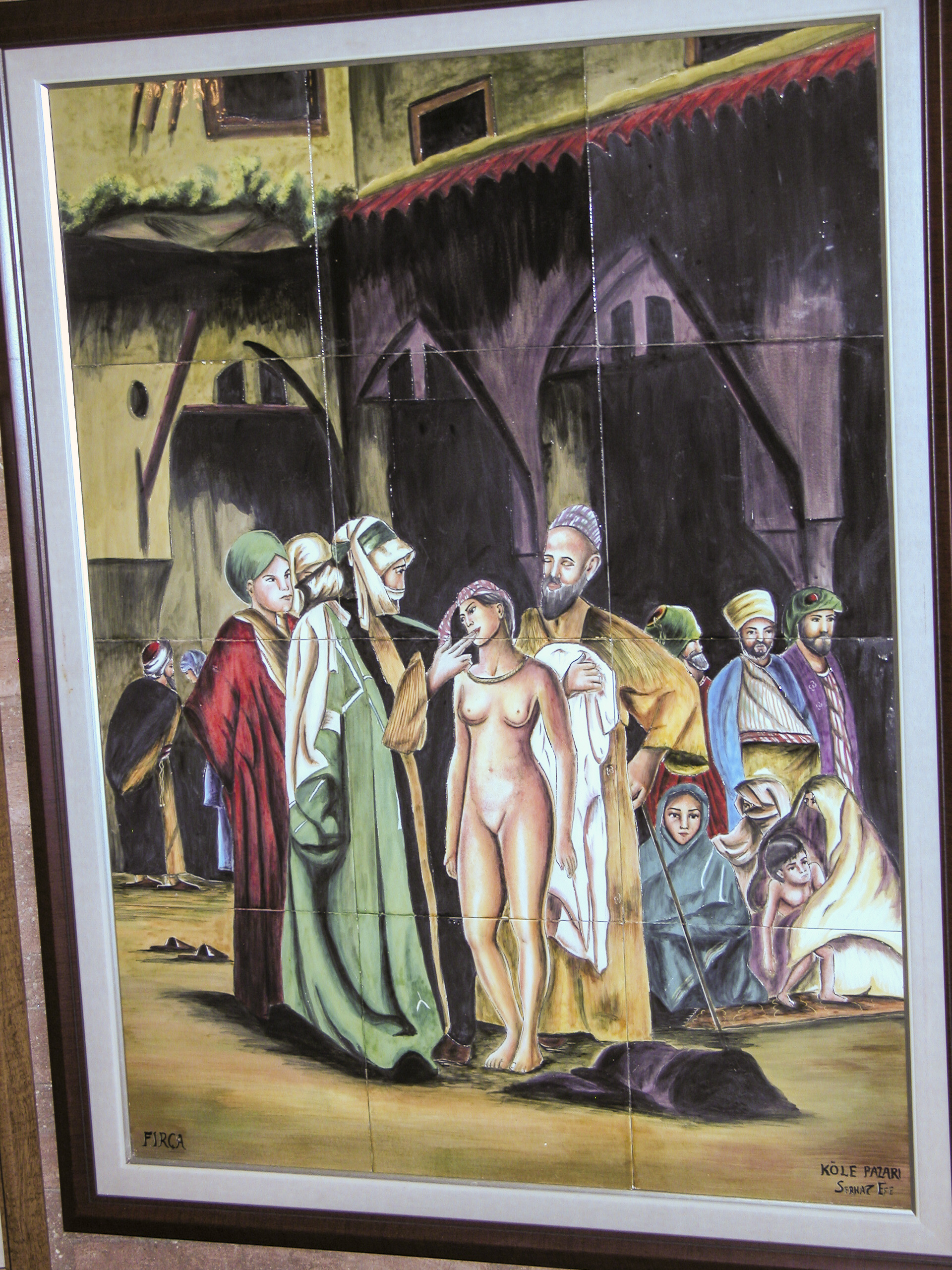
The tile mosaic in the next photo appears to depict a scene in a slave market, where a prospective customer sticks his fingers into the mouth of the naked slave girl being auctioned off by way of checking her teeth. I found this piece to be in rather poor taste and of little artistic merit, and I’m surprised that Turkish (or foreign) feminists hadn’t hounded it off the market. To be fair, it was the only one of its kind I saw in the shop.
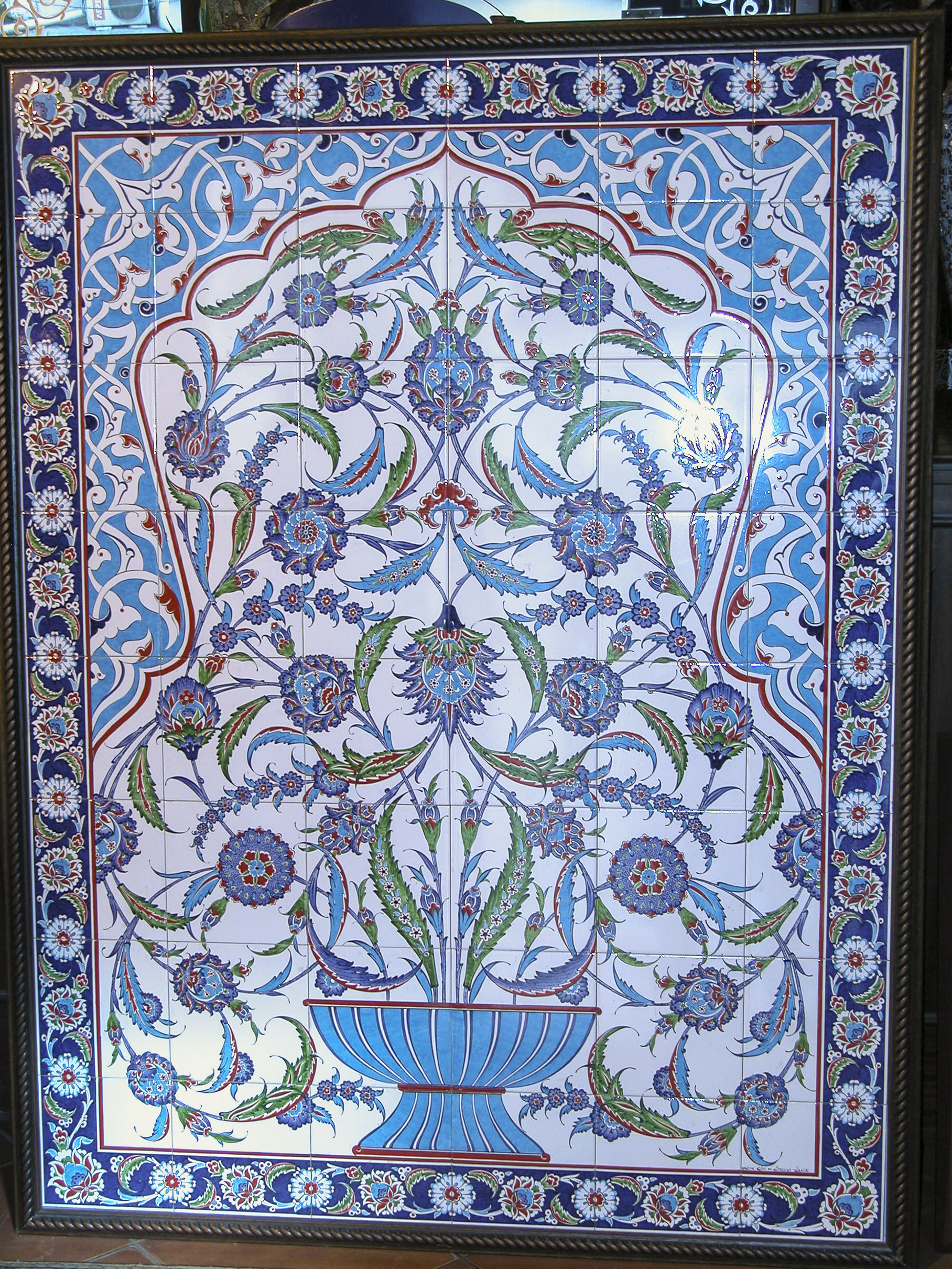
This next tile mosaic was my absolute favorite. I would be delighted to have it on my shower wall.
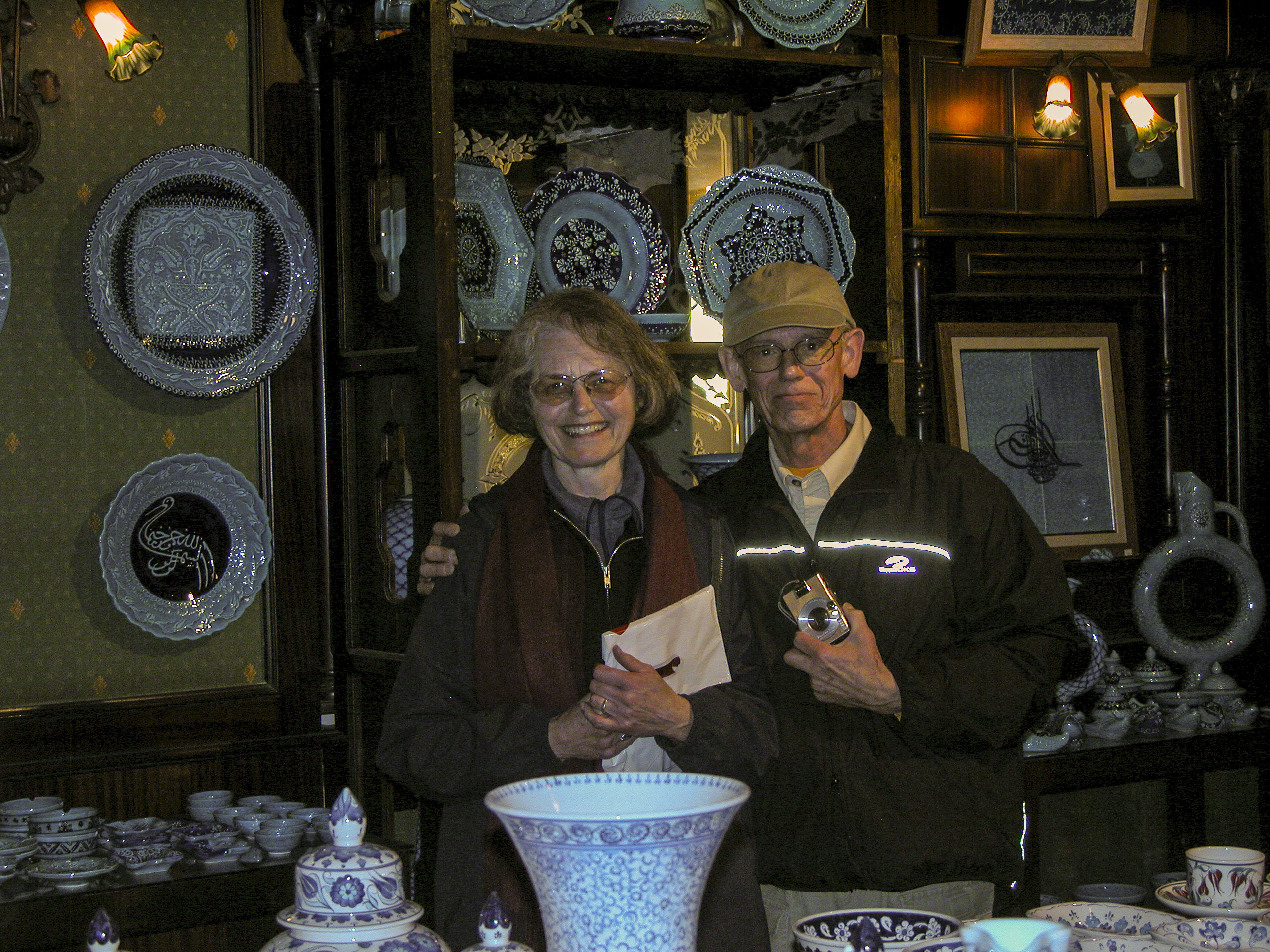
Chuck and Elouise Mattox seemed to enjoy the ceramics just as much as Sandie and I.
Sandie and I resisted the almost irresistible temptation to acquire any of the exquisite pieces on display. For one thing, we had already spent all our spare cash on the rug we bought in the Doğus Hali carpet factory. Another consideration was that I wasn’t very confident that we could get an expensive, fragile ceramic home safely in our luggage, and it would be prohibitively costly to have it shipped.